Typography/Logos in Illustrator


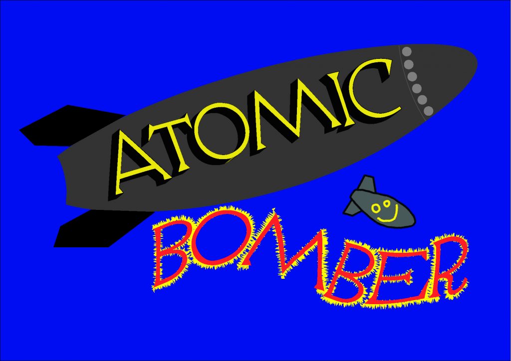
The above image was my first attempt at redoing the logo of the popular mobile game ‘Atomic Bomber’. I wanted to retain the colour scheme of the original logo while making the logo a little more complex. I based the shape of the bomb on a reference image and made it by manipulating shapes made from the various shape tools in Illustrator. The text was made by using various effects available. The word Atomic was done by using the bevel effect to make it stand out while the word Bomber had the Twist effect added to it. I then duplicated Bomber and added the Roughen effect to it to try and create a fire visual. The original bomb was also added to reference the original logo. As a first version, I think that it looks alright although the Bomber is a little out of place and the placement of the new bomb doesn’t match up with how the bombs work in the game. To improve it I would change the Bomber word somehow and I would change the rotation of the bomb.

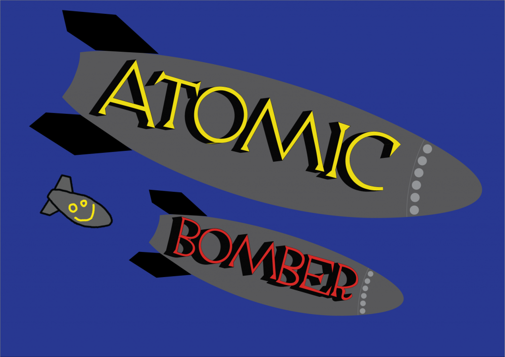
This is the improved version of the Atomic Bomber logo redesign as I think it is a little more visually appealing. I duplicated the bomb and Atomic word and made them smaller so that they had a consistent appearance with the Atomic bomb although I did make the Bomber word red. I also rotated the bombs so that they look like they have been dropped out of a plane.
I enjoyed designing a logo in Illustrator but I feel like I would rather explore another aspect of 2D art for my assignment.