Level Design Development Log 3: Finalising Level
In this third and final development log, the level’s features will be finalised with playtesting and implementation of sound also being discussed. Some more principles of level design and asset changes will also be brought up as they are implemented in this development phase.
Level Changes:
The platform cinematic was optimised as it was a little tedious if the player had all three reliefs and hadn’t put any in yet. It was made so that the player is able to place all the reliefs they have with one button press rather than placing them one by one. The level sequences were also changed as the camera was separated from the individual platform sequences and made into its own sequence as the optimisation meant that the cinematic could show all three platforms rising at the same time so this would be more efficient. The camera was also made to move across the garden area so that the level sequence was more interesting while also showing all the platforms.


To make sure the player knows what they have to do to progress in the game notes were added in the parts of the level that need some kind of direction for the player. This is because the bookcase puzzle and the safe code would take too long without direction and would be quite tedious making for a poor gameplay experience. The note in the office gives a hint as to what order the books need to be placed in and the note in the bedroom tells the player to search the other rooms to find the safe code. As there are four rooms, one digit of the code can be found in each.
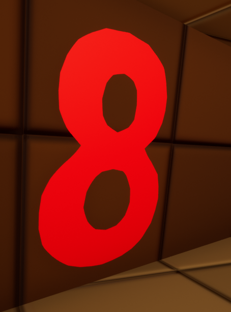

The death functionality before didn’t really give much feedback to the player as to what actually happened and also stopped the player from continuing without closing and restarting the game. To mitigate this a death screen when the player is hit by the freezer wall was added so the player actually knows what happened and the game restarts automatically after three seconds.

The end of the game had a similar issue to the death screen as the player wasn’t informed as to what had happened and was unable to move. So an ending screen was added when the player finishes the level so that they are aware and it also restarts the game after five seconds.
To make the ending of the game more interesting a level sequence animation in which the player places the knife into the corpse was added. It is very similar in functionality to the relief placement sequence. More red arrows pointing to the end level were also added that are enabled as soon as the player has the crest in their possession to signify the last stage of the level.


In a GDC (2015) talk about the level design of Gone Home, two of the developers who worked on the game Steve Gaynor and Kate Craig talked about how to make a linear level feel non linear by using “keys and gating to lock off major choke points”. This makes a linear path feel non linear as it seems like the player is free to explore but they actually need specific items to progress that are obtained in a predictable order. To achieve this within the level the positioning of the key items for most of the puzzles was changed so that the player would have to explore the level before being able to easily progress in some of the areas.
Before adding sound to the level, the textures and models were finalised. Mostly only textures were changed although some new models were added in place of old placeholder ones obtained from free asset packs on the Unreal Engine store.
Adding Sound:
To make the level feel more complete sounds were added to some of the aspects of it and to some of the player’s actions. Ambient sound was added to the exterior part of the level and background music to the interior that sets the mood for the level. For the player, a noise when the player uses the flashlight and footstep audio were added. The fire now makes sound when it is activated and when the floor collapses a sound is played for that. Every door now has audio when opened and closed.
Playtest Feedback:
Player Changes:
Originally, the player was made to be quite slow in the level as the intention was to have the player carefully explore the environment rather than just running through the level. However, this was taken to the extreme originally so after some feedback from play testers the speed of the player was changed to make it much quicker but also keeping it with the gameplay idea.
From playtesting, it was discovered that if the player crouched near a wall they were able to see the outside of the level. To fix this the positioning of the player’s camera and mesh in relation to the player’s collision had to be adjusted so that it was on the edge of the collision rather than inside it.
Level Geometry Changes:

The area with the key and the pedestal originally had no way of getting down to the garden as the idea was that the player had to go back through the building after getting the key. This proved to be more of an annoyance though as it required the player to go back through the building multiple times so a spiral staircase was added near the pedestal.
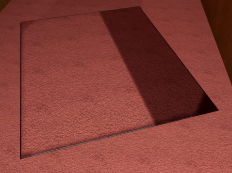
The play testers gave feedback on the sequence in which the floor breaks underneath the player as they stated that the floor was too obvious which meant it could be easily avoided. To change this some more geometry was added to the breakable floor blueprint that mostly blends in with the floor to hide that this floor will break.

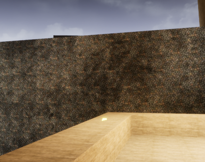
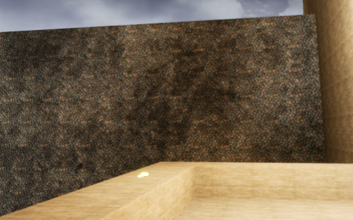
In the garden of the level, play testers noted that there was some interior geometry visible on the right side of the garden. To fix this the walls of the garden were made slightly bigger so that they covered all the geometry that shouldn’t be visible.
Door Changes:
The positioning of all the doors in the level was adjusted as a lot of them weren’t placed well so they would clip with geometry when opened.
The doors within the level were able to be constantly opened and closed as noted by the play testers which ruins the immersion of the game. To fix this issue, a new aspect had to be added to the door blueprints which detects whether the door is currently moving so that it can’t be interact with again.
Keypad Changes:
While testing the game, it was made clear that it was hard to know what button the player is going to press when they interact with the keypad. To counteract this issue the colour of the buttons change as the player is hovering over them. The player is able to interact with the UI on the keypad as a widget interaction element is added to the player that emits an invisible line a limited distance away from the player to detect the keypad UI.
Play testers mentioned that the keypad didn’t really feedback to the player well so the keypad blueprint was changed so that a error message is displayed when the player enters the wrong code. There was also optimisation made for camera adjustment as the numbers were a little small for the new position of the camera.
Freezer Changes:
From playtesting, it was clear that the freezer interaction needed some changes because it wasn’t efficient in how it functioned and the UI didn’t update while the player was close to the interaction collision. It also caused some errors that didn’t really affect anything but could be fixed. The freezer relief blueprint was edited so that the UI flowed better.
UI Changes:
During the playtesting stage, feedback was given about the various bits of UI throughout the level. One of these bits of feedback was that the UI text was sometimes unreadable when the player is using the flashlight so an outline was added to the text to stop this. Another bit of feedback was that most of the interaction UI has too much space in the text. This is because of the way the interaction text was done so that it could be used on multiple items but it causes a space sometimes as the item name is a different text element. To fix this the interaction text had to be changed to use a different method where only one text element contains all of the text including the item name while still allowing it to be changed for different items.
The last bit of feedback was that there is no UI Prompt telling the player that they don’t have an item so the player won’t know if they can interact with parts of the level without the required item. A message was implemented to all blueprints that involve the player placing items so that they know it can be interacted with before they have the item.
References:
GDC (2015) The Level Design of Gone Home [Video]. Available online: https://youtu.be/n6__ftHSEfM [Accessed 28/04/22].
Level Design Development Log 2: Level Functionality
In this second development log, the continued development of the game will be documented until the point at which the game can be played from start to finish. Principles of level design will also be discussed if they are implemented into the level at this point.
Exterior Level Changes:

In the exterior level, the geometry around the forest area was adjusted so that the skybox can no longer be seen on the edges of the forest. This helps to sell the illusion of the path being deep in a forest when in fact the trees are only around the area that the player can see and navigate in.
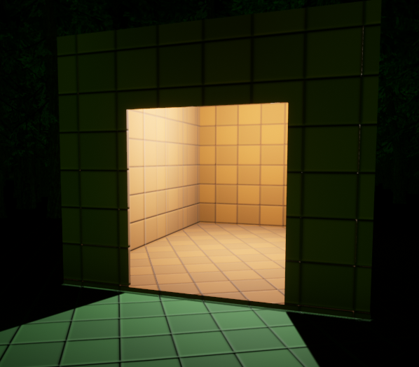
Geometry Changes 2
Geometry around the hut that the player receives the flashlight in has also been adjusted. This was so the hut could be placed on flat ground as before it was visibly off of the ground. Although, this wasn’t an important change to make it was a very easy and quick thing to do.
As mentioned in the first development log, the player could walk past the hut without getting the flashlight originally. This meant that the player could avoid activating one of the level’s main mechanics and potentially have a hard time getting through the level. To fix this an invisible wall was implemented that also informs the player of why they can’t go ahead.
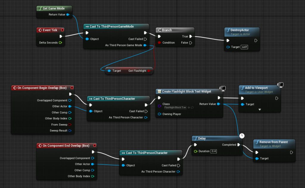
The blueprinting for this was very simple as it used the same variable that allows the usage of the flashlight to know when to delete the invisible wall. The UI element that informs the player that they can’t proceed uses an box collision element to detect when the player is close enough to the invisible wall so that they would need to be informed of why they can’t pass.
Interior Level Changes:
For the interior level, the first changes were made to the functionality of the platforms that appear after the player has placed the reliefs. Rather than the platforms just being toggled as being visible when the player places the reliefs a cinematic was implemented to also show the platforms rising from the water. This was achieved by using level sequences that play when the respective relief is placed into the pedestal, controlling both the respective platform and the camera so that the player is aware of the change. The camera was also included in the level sequences because originally it wasn’t obvious what the reliefs being put into the pedestal meant but with the camera the player immediately is told what has happened.

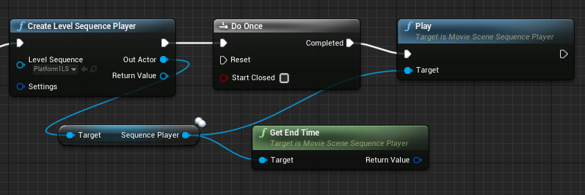
The original blueprint functionality was kept which is the blueprint detecting when the player has placed the relief associated with the platform so that the box collision can be deleted and the platform mesh can be made visible. The cinematic functionality was added after this which is just blueprinting that plays the respective level sequence.
The freezer puzzle now functions closer to what is intended. Originally the player could take the relief without any consequence and skip the whole puzzle part of the dining area. Now the player has to have obtained the fake relief to leave the freezer with the kitchen relief. This is because the fake wall of the freezer actually moves towards the player when the relief is picked up.
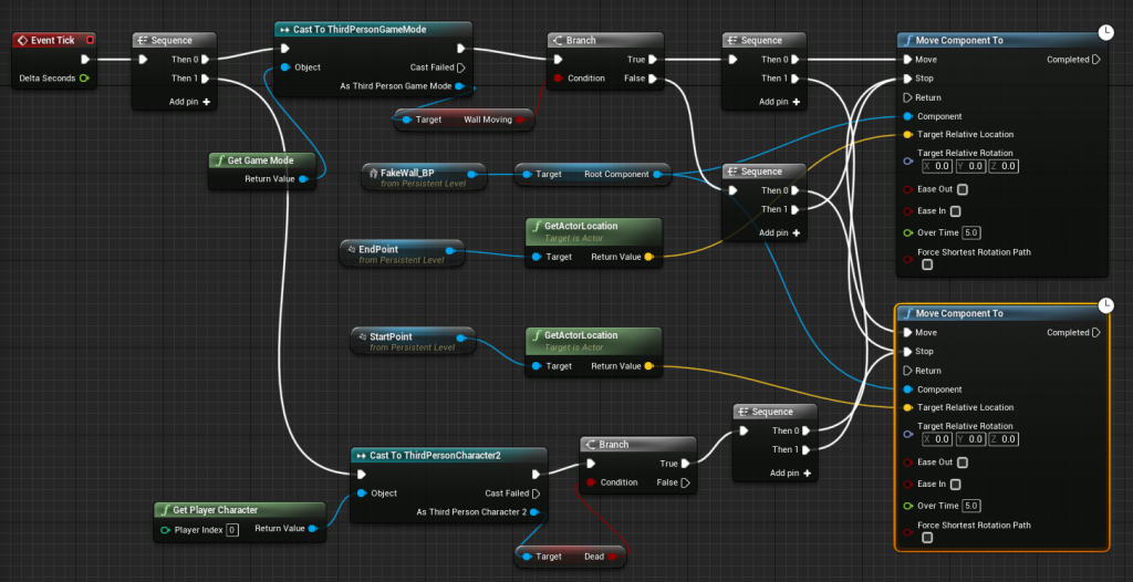
The functionality of the freezer wall moving is contained within the level blueprint so the locations the wall needs to move between can be set using target points within the level environment. The fake wall blueprint within the level is referenced here to and moved to whichever location it should be going to dependent on what state a variable is in known as ‘Wall Moving’. This variable is controlled within the blueprint responsible for the relief functionality within the freezer. Earlier attempts at making the wall move used similar blueprinting to what is used to animate the doors in the level but the wall movement wasn’t working correctly and it would fly off into the void outside of the level. This is probably because of how the fake wall blueprint was structured and rather than changing that the current way of achieving the same result was tried which proved to be a lot more accurate in moving the walls where they were supposed to go as the earlier attempt was done by putting in the values of the target locations for the walls manually.
The wall was now moving but the wall functionality was not yet completed to a point that was satisfactory for this point of development. To get it to that point more functionality was added to the wall that revolves around the act of the player actually being killed by the wall when the wall collides with the player.
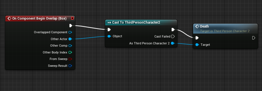

To ‘kill’ the player a collision box is attached to the wall that calls an event within the player character’s blueprint when it detects the player. This event disables the ability for the player to move and also makes a boolean variable true that stops the fake wall from moving when it is in this state. This is only a placeholder for the player death functionality as there is going to be an UI element to it later that states ‘You Are Dead’ and then the level will restart from inside the mansion.
The first challenge the player comes across within the bedroom and office section of the level is that they need to find a way into the office as the door is blocked. To do this the player has to locate a button within the bedroom that opens the vent which allows the player to then enter the office.
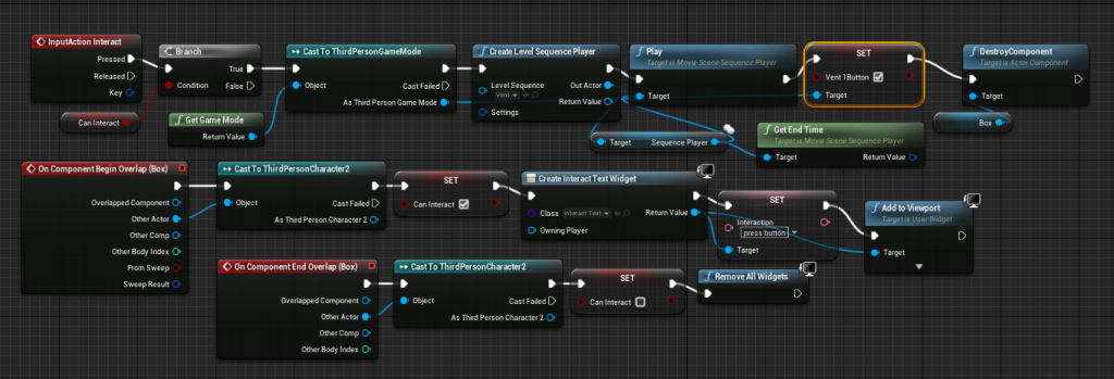
When the button is interacted with it plays a level sequence that shows the button being pressed while also changing a variable so that the vent knows to open. The way the player interacts with this button is the same way most of the interaction within the game works. A collision box is used as a trigger to know when to show the UI and remove it based on when the player overlaps and moves away. At the end of the bit of code where the level sequence is activated the box collider that triggers the UI is also removed.

The vent door blueprint contains the functionality for the vent animation. After the vent button variable is set to true, a timeline is activated that moves the vent door. To know where the vent door should start and end a lerp is used which is then plugged into a SetRelativeRotation block attached to the vent door model so that the vent door will move to the position it is supposed to be at during the timeline.
The door to the office area of the mansion could be used straight away before which was not the intended flow of the area. To change this a variable was added that is used to stop the player from being able to interact with the door until they have unblocked it from the other side. This functionality was adapted from the locked door functionality as it is the same idea just with a different variable being used.
To unblock the door the player must move a chair from the door by interacting with it. The player is only able to interact with the chair from the side the door is blocked from as the collision to enable interaction with it is placed and scaled in a way so that this effect is achieved. A level sequence is used to manage the movement of the chair and after this sequence is played the variable for the door is changed so that it is now interactable. The door unblock sequence is used so that the player doesn’t have to go back through the vent and bedroom area allowing the player to leave this part of the level quickly without retreading old areas as the player already has to explore the building a lot.
One of the main puzzles of the level is contained within the office as one of the reliefs for the pedestal is obtained in this room behind a bookcase. Before the bookcase was already open and the player could just grab it. Now there is an actual puzzle to solve that involves placing three books in the right order on the other bookshelves. For now the books are placed on the table in the office itself but later they are probably going to be placed around the level. For now, there is no clear indication of where the player should be placing books as the assets aren’t yet finalised. Later the bookcases will be filled so the spaces where books should be placed will be more obvious.

The blueprints for placing the books are very large but also quite repetitive so to explain them more efficiently snippets have been shown that can be used to explain the full blueprints. When the player enters the collision for interaction with the book placements, the player has the option of placing any of the books. This is so this puzzle is actually a challenge rather than just another find and place mechanic. Each book has its own key input for example pressing 2 on the keyboard will place the second book which is told to the player in the UI. The UI for each book will only show up if the book is in the player’s possession which is detected through the use of booleans for each book. Before the player has the correct combination the player can also pick up the books after they have been placed. The above screenshot shows the functionality for placing the first book. The player can only place the first book if they are in the interaction radius and if a book hasn’t been placed yet. Once the player presses 1 the first book’s variable is now false to tell the blueprints that the player no longer has the first book and a static mesh is made visible to show the player a book is placed. The variable to detect whether a book is placed is made true and the number of the book placed is put into a float so the book the player can pick up from this location matches the one they placed. To made the UI transition more smooth the UI for book placement is removed when the player places a book and immediately replaced with the UI for picking up a book. If the player places the right book another variable is set to true that tells the blueprints that the correct book has been placed in that location.

The order in which the player is supposed to place the books is not yet able to be figured out any way except for trial and error at the moment but when the narrative elements are added to the level later there will be a hint implemented. Once all three books have been placed in their respective locations the interaction collision for each book placement blueprint is removed so no further changes can be made to the order. A timeline animation is also played that opens the bookcase to reveal the second relief. The blueprint for the second relief had to be changed a bit as it could be picked up through the bookcase. This was achieved by not allowing the player to interact with the relief until the bookcase has been opened which is controlled through another boolean variable that is set to true when the timeline animation is complete.
In a GDC (2018) talk about ‘Ten Principles for Good Level Design’ by Dan Taylor, a point is brought up about how good level design is surprising in which one of the main points was to disrupt paradigms within the level. A specific quote from the talk is “be subversive, take an existing game design paradigm… and flip it” which has been attempted to be implemented in this level. After the player has obtained the second relief, the floor in the hallway of the bedroom and office area will break and cause the player to fall to the kitchen area. This is to disrupt the pacing paradigm of the level as the player has been free to explore the level however they wanted at this point and this shift to a different area is something that changes up the level flow unlike the rest of the level. The floor breaking was achieved using an Unreal Engine plugin called Apex Destruction that allows any static mesh to be broken apart inside Unreal Engine itself rather than doing it manually. The plugin allows a destructible mesh to be created that can be broken inside blueprints so when the player enters the collision for the part of the floor that is intended to break the destruction is activated and physics are added to that part of the floor so that it is affected by the simulated gravity.
The safe puzzle is the final puzzle needed to obtain all three reliefs. As the case was with most of the other puzzles, before the relief could be grabbed out of the safe without doing anything as the player. However now the player must enter a four digit code into the safe for it to open. The code currently is 1234 as a placeholder as the actual code in the final level will be found out by searching the nearby guest rooms. For now there is no indication of what the code is in the level. The relief inside the safe was adjusted like the second relief so that it can’t be interacted with until the safe is opened.

The keypad UI blueprint is shown above. Each button on the keypad is stored within an array so that when they are pressed the number they are assigned to is added to the display on the keypad. This is done by append the digit of the respective button to the variable that is used for the display and then setting that as the variable. To get it to show up on the display the variable is converted to a string variable. The length of the keypad variable is also detected at this point to see if it has reached four digits so the code can be checked. A event dispatcher is called at this point known as Code Entered.

The blueprint for the buttons was set up in a way that would allow each button to stem from the same blueprint. This was achieved by making the digit integer variable public so the value could be changed for each button in the keypad blueprint when they were added. To make this value be shown on the button it is applied to the text on the button before the keypad UI is loaded into the game.
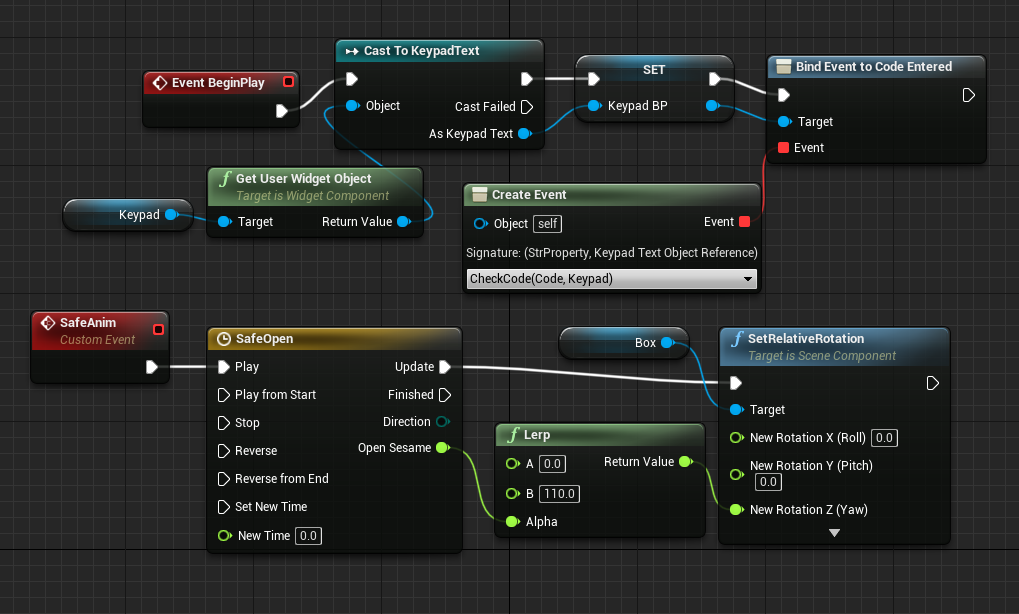
The top line in the safe door blueprint is used to create the function in which the code is checked when the keypad blueprint has called the Code Entered dispatcher. The bottom line is a timeline animation for the safe door.

This screenshot displays the function in which the code is checked which is done by comparing the input code variable to another variable. If it is not the right code, then the input code variable is reset to allow the player to input another code. If it is correct, the timeline animation is played and a variable is set to allow the relief inside to be interacted with. The keypad is deleted at this point but it will be adjusted later so that the ability to input a code onto it is removed rather than the whole keypad.
The final element of the level is contained within the living room. The goal is to recreate a scene within the living room by finding an item and placing it where it is intended to go. For now it is very simple as it was implemented to just allow the player to finish the game. In the final version of the level, this sequence will be a little more complex as it will involve a level sequence when the player places all of the items.

Some of the functionality for the living room section is contained within the level blueprint. This is so the arrow used to tell the player that there is somewhere to go down the hallway will only appear when the player is supposed to go to living room without creating a new blueprint class for the arrow and instead just referencing the static mesh that is placed in the level. The other bit of functionality stops the player from moving and performing any input when the scene has been finished by tracking the boolean variables for the different elements of the scene. This serves as the ending of the level for now. An idea for the final version of the ending has a UI element appear to inform the player of the ending and then the game will quit.
References:
GDC (2018) Ten Principles for Good Level Design [Video]. Available online: https://youtu.be/iNEe3KhMvXM [Accessed 15/04/22].
Level Design Development Log 1: Blockout Prototype
Level Explanation:
In this first development log, the focus will be on the blockout of the level discussing the principles of level design which were implemented. The intended gameplay of the level will also be touched upon as it isn’t fully implemented into the level at this stage and some of the blueprints that bring functionality to the level will be shown.
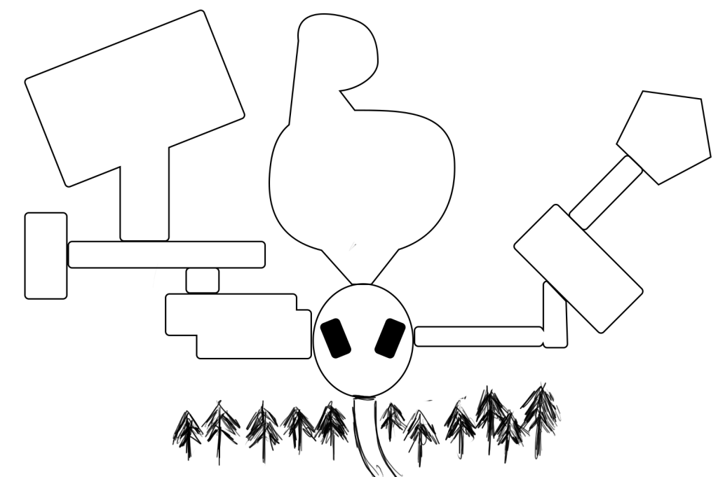
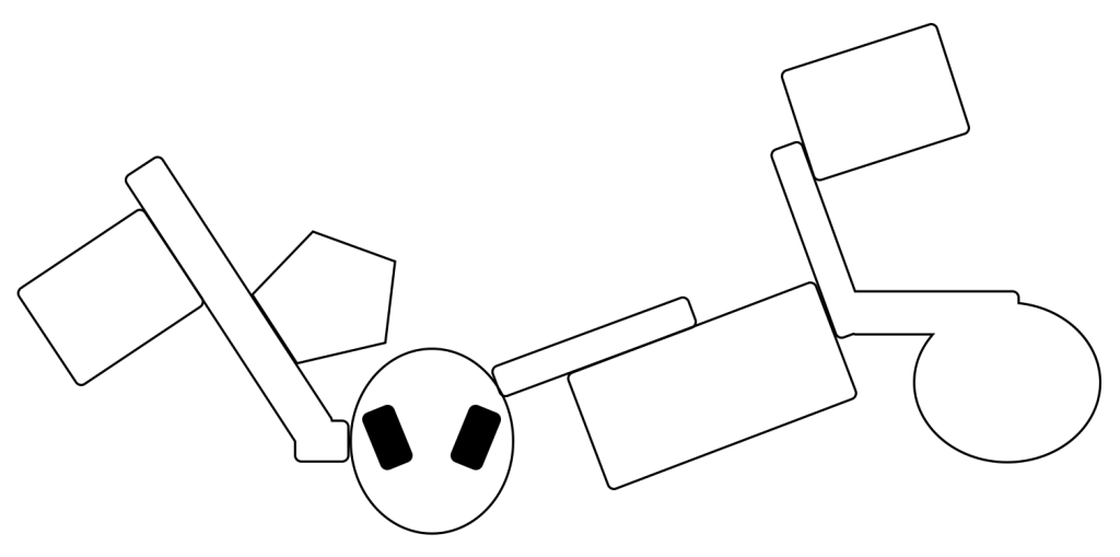
These images show the early ideas for the level design. While most of this design didn’t get used for the actual level blockout it still informed the general ideas for the level design. The primary things taken from this design are: the main lobby being cylindrical in nature, the four different areas inside the building although they are simpler in the blockout, the garden area with the part at the back and the forest start for the level though it is more complex in the blockout.
Exterior Level:
The first part of the level is the exterior section. This section is intended as a tutorial for the base mechanics included in the level. Although the mechanics aren’t too complex, the introductory part of the level was still dedicated to introducing the player to them so that the player would be familiar with the mechanics later in the level. The player starts at the entrance to the forest path with a basic barrier and ‘car’ behind them to insinuate that they drove to this location.
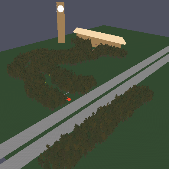
Ahead of the player are three lampposts leading the player along the intended direction as well as more direct path signified by the brown blockout material. Game Maker’s Toolkit (2015) made an excellent point in a video about the design choices used by Naughty Dog called ‘Why Nathan Drake Doesn’t Need a Compass’ where they state that “light is the most common and arguably effective way of guiding the player” which is why the lampposts are used to lead the player at first as there is no other source of light coming from a location the player can go to.

Along the path, the player will also catch a glimpse of a lit up tower that gives the player a visual for what they are heading towards. This is an example of a weenie which Game Maker’s Toolkit (2015) also mentions in the video as being a “navigational aid” which is exactly the reason it is included as it is visible from multiple points in the forest area allowing the player to orientate themselves within the game environment.

As the player follows this path, the crouching mechanic is introduced as there is a fallen tree in the player’s path that can only be crouched under to proceed. To inform the player of this mechanic a UI prompt is shown when the player is close to the fallen tree trunk which also tells the player which button is associated with crouching.
The player then passes the last lamppost before coming across a small shack that is emanating light. This is to draw the player in as the shack contains an necessary item for the player to obtain. This is a flashlight as the player needs this throughout the level to navigate dark areas.
As the player goes to leave the shack, they are prompted with the button to activate the flashlight to inform the player of the button to use this mechanic. The path from this point onwards is navigated using this flashlight but there is nothing to stop the player from continuing onwards past the shack without the flashlight yet. When the level is further developed the player will be stopped from continuing if they decide to ignore the shack perhaps by using an invisible wall and UI message that says something along the lines of ‘The path ahead is too dark to continue along’.
Although there are no more lampposts to guide the player, the tower weenie is still visible to affirm the player that the brown path is still the right way to go. In this blockout, the tower has an emissive material applied to parts of it to make it always visible. This is merely a placeholder for now as it signifies the role the tower has before it is implemented properly.
As this is still the blockout phase, most of the environment is simple and designated using colour however when it comes to the forest the foliage tools were experimented with. Usage of the trees allowed the limited environment to be hidden as well as making the world feel a little more believable. However, there is an issue with the skybox that ruins the immersion a little bit so it will have to be adjusted as the level is further developed.
Interior Level:
Entering the mansion opens the level blockout to the exploration aspect of the blockout. The player is free to explore most of this interior environment after they find a key for the doors as they are all locked but one. This was so the player would be informed of what the next goal is within the level as the key the player is looking for is placed in a position that also highlights a statue as it is very clearly lit up.
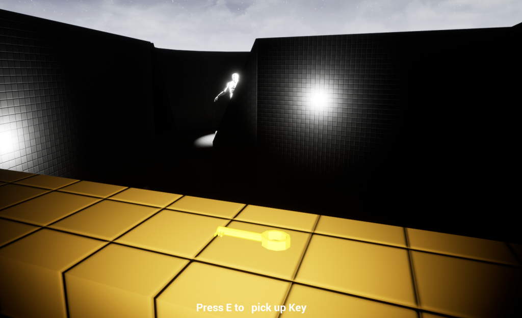
Near the key, the player also comes across a unique point of interest which is some kind of pedestal for what looks like three similar items. This is how the player is going to be able to access the statue at the bottom of the garden area.

The statue is inaccessible to the player at first as there is a water section at the bottom of the garden. As the player places the items within the pedestal a path is made for the player. For the player to find these items they must explore the other parts of the level.
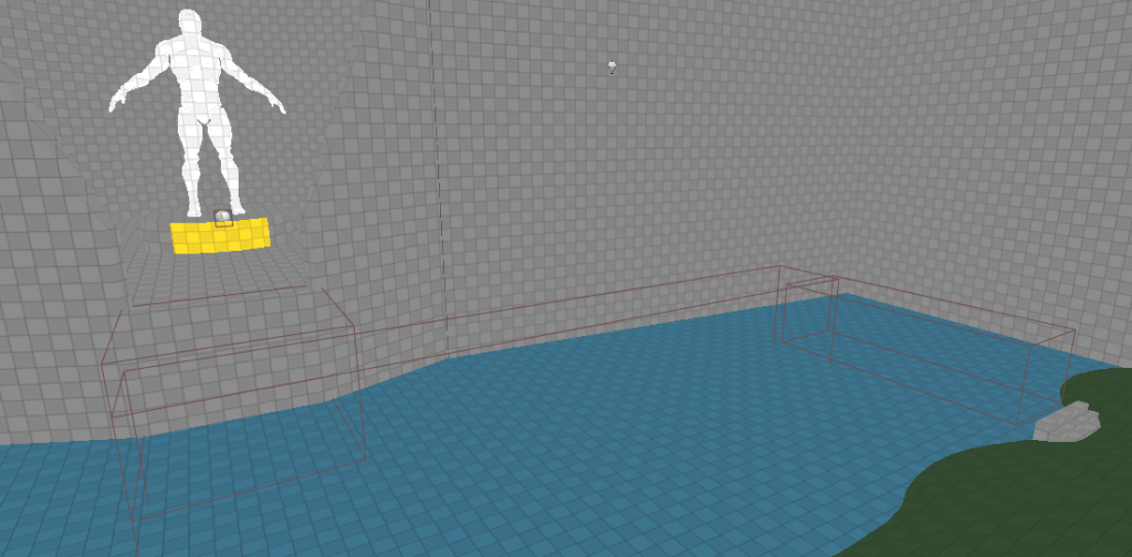
Obtaining the key allows the player to explore the dining area, bedroom/office area or the guest rooms area. Each of these areas can be explored in any order as they don’t directly link to each other. However, some key items required for other areas may be spread between these areas to make the level feel more non-linear. The player can also enter the living area hallway but all this achieves is informing the player that the living room cannot be entered at this moment.
The ‘key’ items in the level are currently designated as such by making them yellow. Barclay (2016) writes about how consistency “can give the player familiar elements to help them more quickly understand any new environments” which is why this effect will be kept within the level in some form as the player will know that the item is something that is needed to progress in the game in some way.
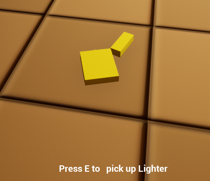
The dining area and kitchen includes one of the main challenges of the level. Completing this challenge will reward the player with a relief which is one of the items needed for the pedestal. The relief can be grabbed in the freezer but as the player takes it the wall behind them is supposed to start closing in as they take it. In this blockout that functionality has not yet been added but it will be a way the player can die within the level.
The solution for this puzzle involves the fireplace located in the dining area. As the player enters the area the fireplace is not lit. To light the fireplace the player has to find the lighter item located in the main lobby for now. This allows the player to interact with the fireplace.
The next part of the solution is to find something that could replace the relief. This takes the form of a plastic board in the kitchen that can be heated so that it will melt into the grooves of the freezer mechanism. After picking up the board the player can interact with the fire again to heat it up and then they can replace the actual relief.
The hallway in the bedroom/office area seems to offer the player a choice but only one of the doors can be accessed at this point. The other door serves as the way back after the puzzle in this area is solved but it also serves the purpose of making the level seem a little less linear.
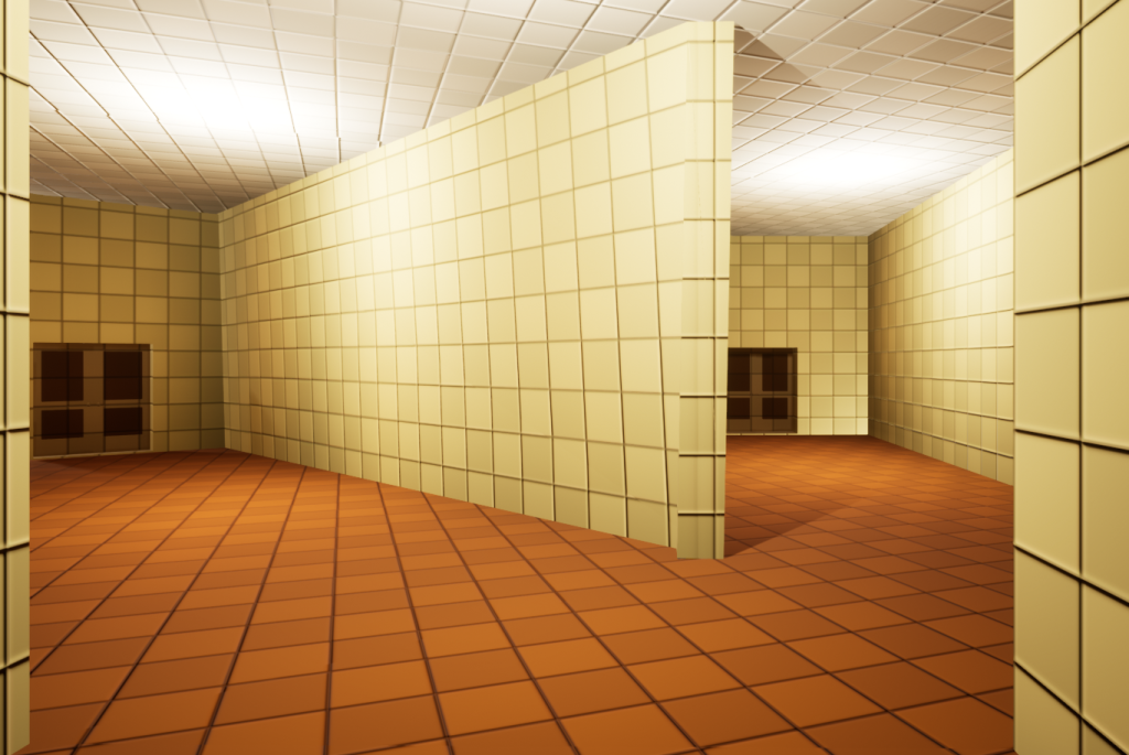
The left path leads to the bedroom. The bedroom puzzle is quite simple as the player is intended to find a button that opens a secret path to the office because the other is blocked in some way. The actual challenge of this area is that the player must organise some books in the correct order which then reveals a secret compartment behind a bookshelf. This is not implemented yet but when it is it the order will be hinted at with some environmental storytelling perhaps in the form of a drawing that the player can find elsewhere in the level.
To leave this area, the player can unblock the office door as it was blocked by a chair. This saves the player a minor inconvenience of having to go back through the vent.
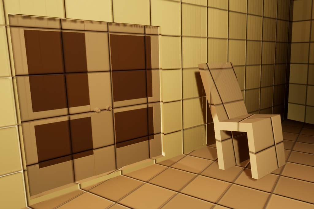
The guest rooms area is also currently unfinished in terms of functionality. The area consists of four similar rooms and a single room at the end that has another one of the reliefs inside a safe. The player is supposed to figure out a code by exploring the four other rooms to use on the safe.
After all three reliefs have been retrieved by the player they can now be placed in the pedestal. This causes a pathway to appear over the water part of the garden to allow the player to get to the statue highlighted when the player first enters the mansion. Under the statue the player finds a crest encrusted in ice. This iced crest can be melted using the fireplace which then allows the player to enter the living room as this was the item required to enter the living room.
A red emissive arrow is on the wall of the hallway leading to the living room. This is because there is a perception issue with video games that can make it difficult to recognise a turn in a hallway. The solution is relatively simple as Alex/TychoBolt (2020) puts it “it boils down to is basically just giving hints of that the hallway continues” which is what I have achieved by using the arrow. The final room of the level has no functionality at the moment but it will consist of finding an item and placing it where it should be to end the game.
Blueprints:
Door:
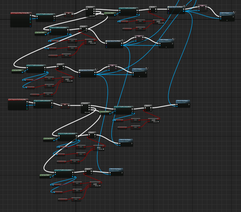
The door blueprint is relatively simple in how it functions. To be able to interact with the door, the player must be within a box collision that is a part of the door blueprint. This is because a boolean variable called ‘Can Interact’ is only true when the player is in this collision. A text widget is also added to the player’s screen and removed based on whether the player is in the box collision or not. This is how the interactions work for mostly every blueprint in the level as it was a solution to stop the player from being able to interact with objects when they are nowhere near them. When the player is able to interact with the door and does so a custom event known as ‘DoorToggle’ is called.
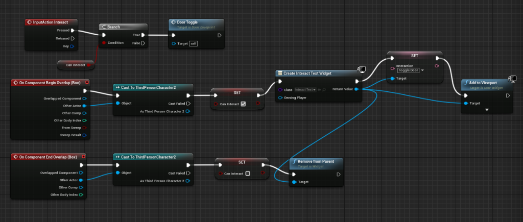
Interaction Functionality
This custom event is what actually controls the actual animation of the door using timelines within the blueprint. These timelines make it so that the door actually moves to the rotation it should be at instead of just snapping there instantly. The actual functionality of the door rotating is controlled by the SetRelativeRotation blocks which get the value from a lerp. The lerp has the open and closed values in put into it as A and B and it uses the timeline to determine the point between these that it should be at which then gets input into the Yaw Rotation value of SetRelativeRotation. A delay is then used that matches the length of the timeline to set a boolean to true or false dependent on what state the door is in.

Fireplace:
The fireplace is a little more complex as it has multiple functions within the level. To keep track of which function it is supposed to do multiple booleans are used to keep track of the player’s progress. For example, the plastic board can only be heated if the player has already fulfilled the first function (lighting the fire) and if the plastic board has been obtained. Most of the booleans are located within the gamemode blueprint to allow all the blueprints to access these variables as it is very easy to cast to the gamemode blueprint. The functions of the fire mainly just change these booleans to allow other blueprints to be interacted with within the level except for the first function which also toggles the visibility of the fire particle system element of the blueprint.

The rest of the blueprint is a lot of repetitive functionality managing the UI prompts which I already explained in the door blueprint. The reason there is a lot more here is that the different functions have to be taken into account for the prompt that shows up. There is some changes that can be made to make it a little less complex but it will mostly remain the same in the final version of the level.
References:
Alex/TychoBolt (2020) Level Design In Pursuit of Better Levels. Available online: https://docs.google.com/document/d/1fAlf2MwEFTwePwzbP3try1H0aYa9kpVBHPBkyIq-caY/edit [Accessed 12/04/22].
Barclay, M. (2016) My Level Design Guidelines. Michael Barclay – Level Designer. 13 May. Available online: http://www.mikebarclay.co.uk/my-level-design-guidelines/ [Accessed 12/04/22].
Game Maker’s Toolkit (2015) Why Nathan Drake Doesn’t Need a Compass [Video]. Available online: https://youtu.be/k70_jvVOcG0 [Accessed 12/04/22].
References
Bonhotal, W. (2020) Pelleas (Warrior Armor) [Image]. Pinterest. Available online: https://www.pinterest.es/pin/31032684921166624/ [Accessed 10/1/2022].
Cornet, C. (2016) Cyberpunk Male Character [Image]. ArtStation. Available online: https://www.artstation.com/artwork/xZPWO [Accessed 10/1/2022].
DWolf. (2015) First Ultron Form [Image]. DailySuperHero.com. Available online: http://www.dailysuperhero.com/2015/05/reviewing-multiple-forms-of-ultron-in.html [Accessed 10/1/2022].
Gartler, J. (2015) Ultron Mark 1 in the Party Fight sequence [Image]. AWN.com. Available online: https://www.awn.com/vfxworld/trixter-enters-age-ultron-avengers [Accessed 10/1/2022].
Germán, R. (2019) Sci-fi/Cyberpunk Characters Concept Art [Image]. ArtStation. Available online: https://www.artstation.com/artwork/Dx3O30 [Accessed 10/1/2022].
Giraud, D. (2015) hero [Image]. ArtStation. Available online: https://www.artstation.com/artwork/GvqqN [Accessed 10/1/2022].
JPGraphic. (2015) Two Face / Arkham Knight [Image]. DeviantArt. Available online: https://www.deviantart.com/jpgraphic/art/TWO-FACE-ARKHAM-KNIGHT-538379954 [Accessed 10/1/2022].
Lewis, M. (2017) Beginner’s guide to ZBrush. Worcester: 3dtotal Publishing.
Lim, M. (2015) Character [Image]. ArtStation. Available online: https://www.artstation.com/artwork/character-77d86b3d-cb07-4523-b71f-6717abd2945d [Accessed 10/1/2022].
pacificgraphicdesign. (n.d.) head-anatomy-proportions-1 [Image]. Pinterest. Available online: https://www.pinterest.co.uk/pin/377598749991075109/ [Accessed 10/1/2022].
Shafigina, A. (n.d.) Ideal Proportion Male [Image]. Pinterest. Available online: https://www.pinterest.ie/pin/564638872004098972/ [Accessed 10/1/2022].
Rendered Images and Wireframes
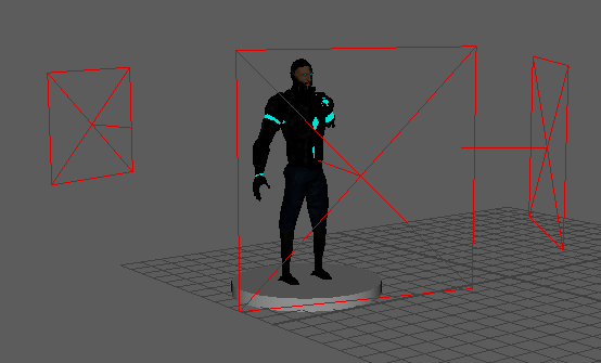
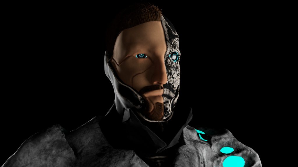
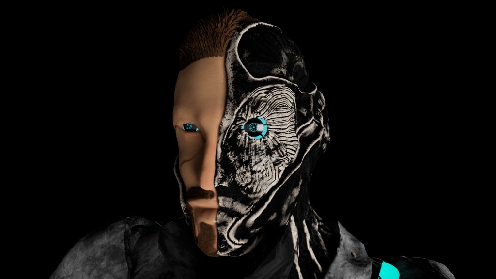
All of my renders were done in Maya using the Arnold Renderer. The lighting that I used in my renders was three point lighting as shown in the image below.
Renders:

Wireframes:
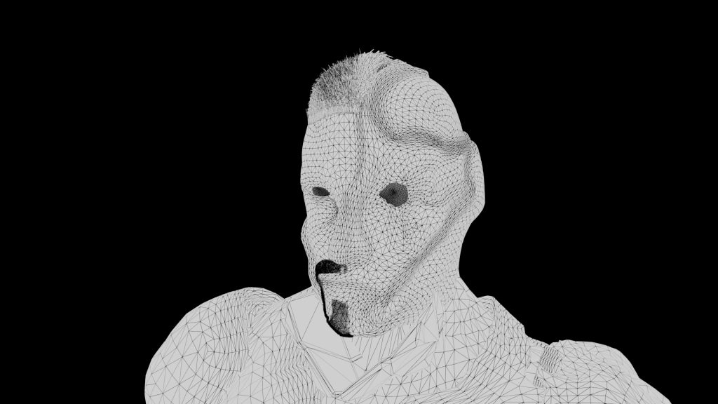
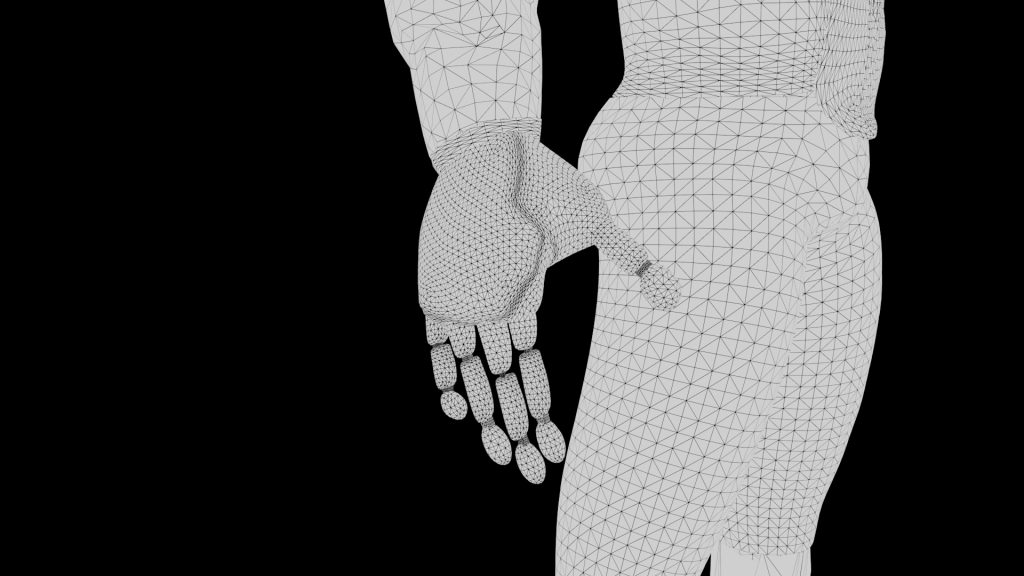
Visual Style and Texturing
When texturing the character, I opted to try and make the textures look as realistic as I could achieve. This was for the same reason I wanted to keep the character’s proportion accurate to a human as I wanted my character to be based somewhat in reality even though the narrative behind my character is very fantastical.
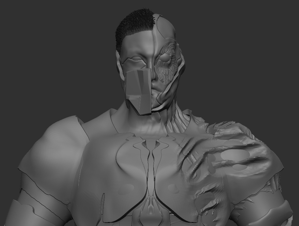
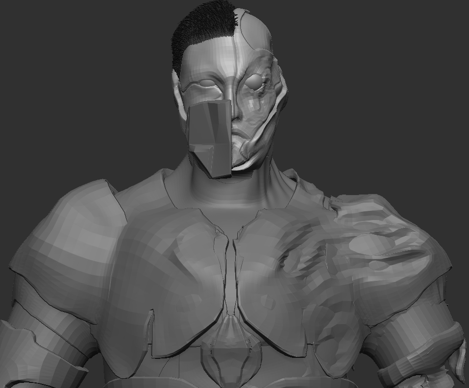
Before starting the texturing process, I used the ZRemesher tool to create low poly versions of all of the sub tools as the model had very high poly counts which would cause issues when rendering the model later. Detail was lost but I could also use the high poly models to bake this lost detail back onto the models in Substance Painter within the textures. This was important to do as my high poly count was 4758365 total polys which was lowered to 402580 total polys for the low poly model.
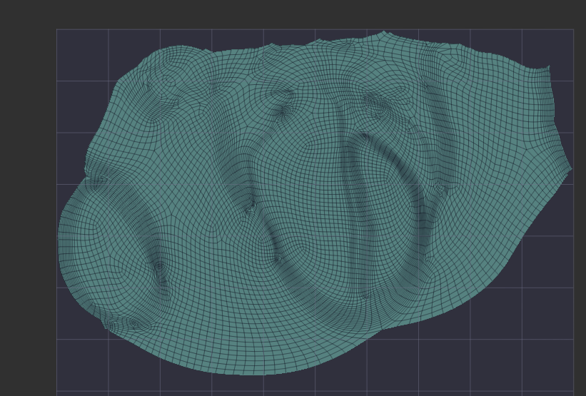
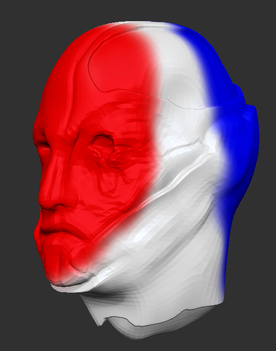
To create the UV maps of the models I used the UV master tool within ZBrush. I’ll use the head mesh as an example to explain the process of what I did as I used the features within the UV master tool to be able to mitigate the seams being visible as much as possible and keep them away from any important geometry especially on the actual face. I was mostly successful in stopping the seams from being on the front of the face, but the UV seams didn’t go where I intended to try and place them.
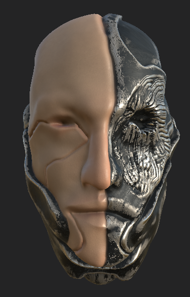
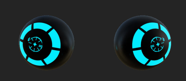
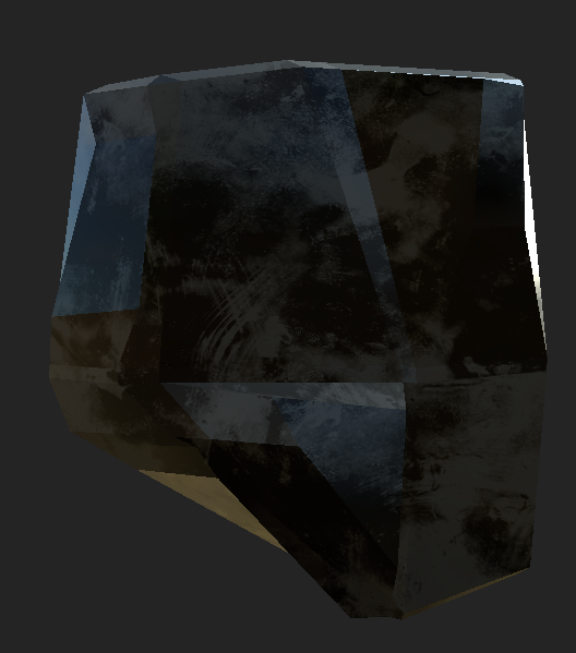
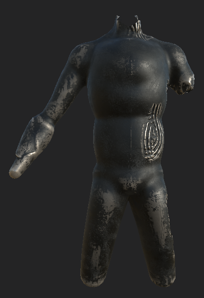
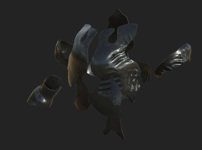
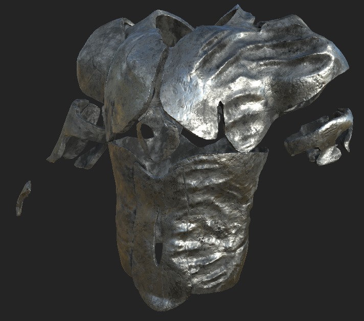
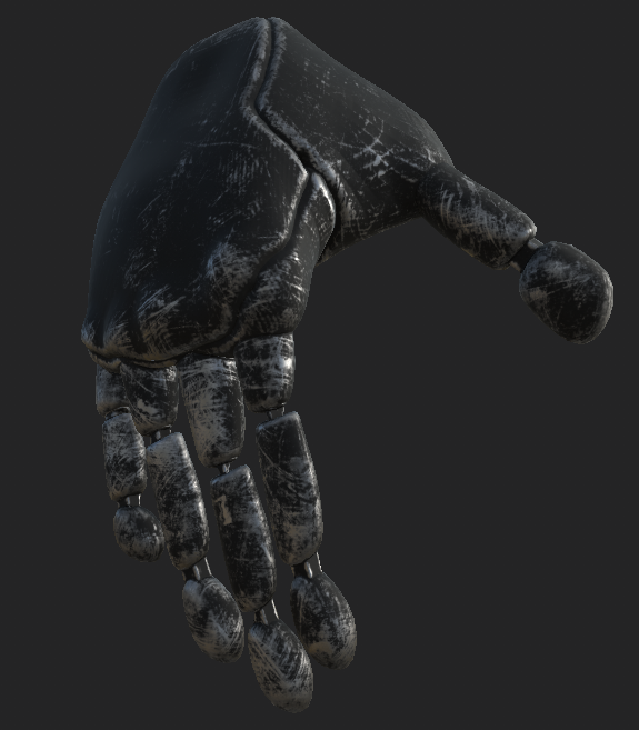
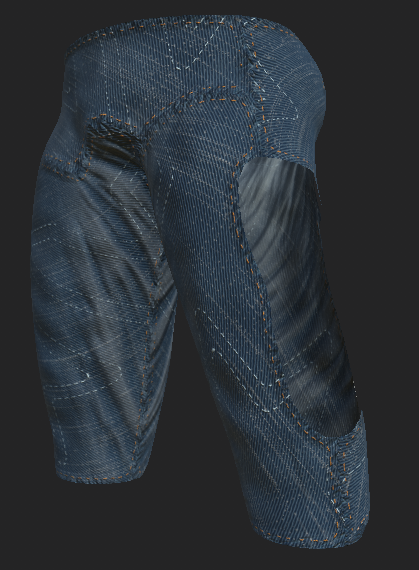
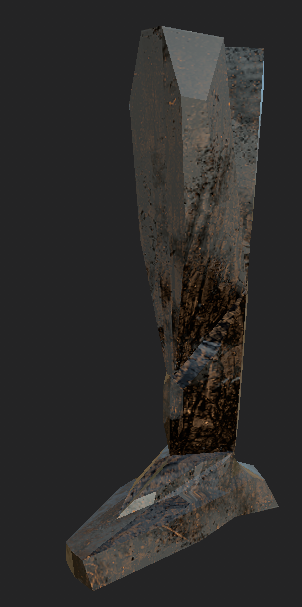
I started the texturing process by first baking in the high poly versions of the model to add that lost detail mentioned earlier back in. This significantly helped to improve the final model as it looked very smooth even though the overall poly count of all the meshes was lowered by a significant margin. To texture the models, I used smart materials as the procedural generation from them really helped me take advantage of the projected detail from baking. The smart materials I used were: Skin Face and Steel Painted Scraped Green for the head texture, Glass Visor for the eyes texture base, Steel Painted Scraped Green for the body, Plastic Glossy Scuffed for the under armour, Steel Ruined for the armour, Steel Painted Rough Damaged for the hand texture, Fabric Denim Washed Out for the pants and Steel Painted Scraped Dirty for both the leg and mask texture.
Most of the texturing was relatively straight forward as I just had to apply the smart materials and adjust the values and colours of the materials. The face texture required more than this though as I had two smart materials to apply to the face. I used a black mask on the Skin Face smart material to set what should be textured as skin and what should be the other smart material. To texture the eyes, I used alphas from within Substance to change what the brush was painting which allowed me to create the interesting shape on the eye. I did this by using another black mask on the Glass Visor material to reveal a blue colour underneath. I had some issues texturing the legs and the mask but changing some of the settings in the Steel Painted Scraped Dirty smart material mitigated this issue.
Description of Accessories
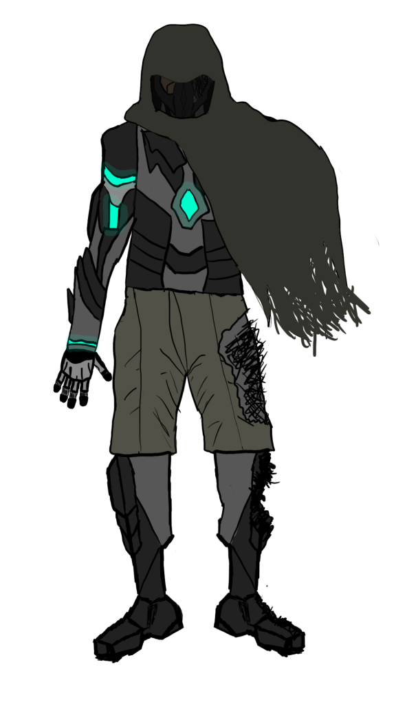
This was another character design that involved an accessory that I tried to make but was unfortunately not able to figure out in time. I was attempting to use NCloth within Maya to create a dynamic cloak around the character model but I kept encountering crashes as well as it not working exactly how I intended so I decided to cut my losses and move on.

The accessory that I did make for the character is the mask. It was supposed to compliment the cloak as a way for Wyatt to remain somewhat under the radar but it’s still a cool accessory for the character even without the cloak. I made the mask within Maya by manipulating a cube using the extrude and bevel features to achieve the end result displayed above. I could’ve spent more time on making the mask more complex but this design matches what I was aiming to create so I decided to keep it like this.
Modelling the Character
First Attempt:
The first thing to do was to model the base mesh of my character as I wanted to model as much of the character I could to the best of my ability.
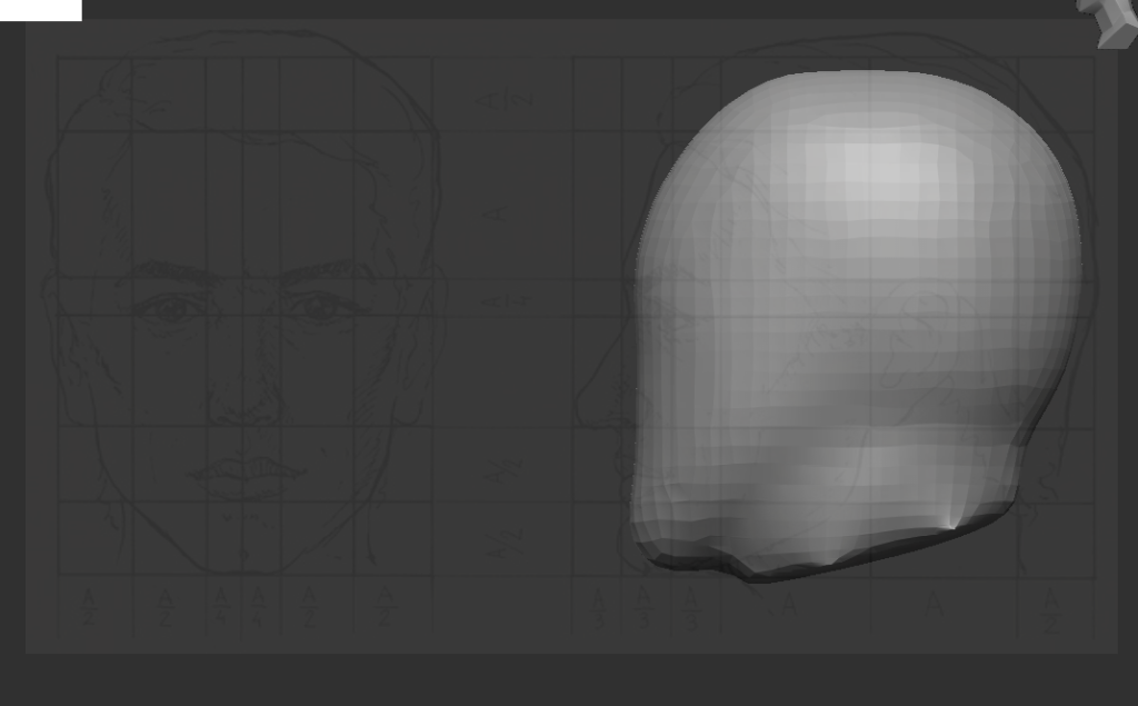
The head was made accurate to the proportion of an actual human using a reference image labelled Figure 9 (pacificgraphicdesign, n.d.). It was created by manipulating a sphere with different sizes of the move brush.

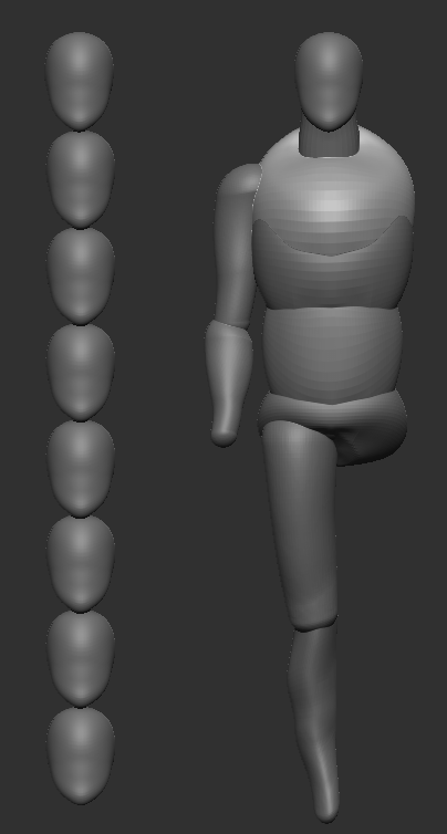
To create the rest of the base mesh, I manipulated a cylinder and spheres also using the move brush to deform geometry into a proportioned shape using another reference image: Figure 10 (Shafigina, n.d.). The eight head method was useful in getting the location of the body parts but the reference helped get the actual body shape.

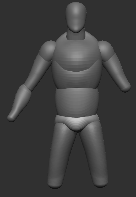
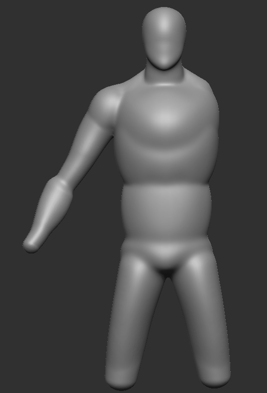
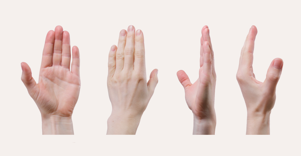
I masked the part of the area that each respective clothing item would be covering and used the extract modifier. I manipulated the clothing using the move brush so that the clothing was damaged.
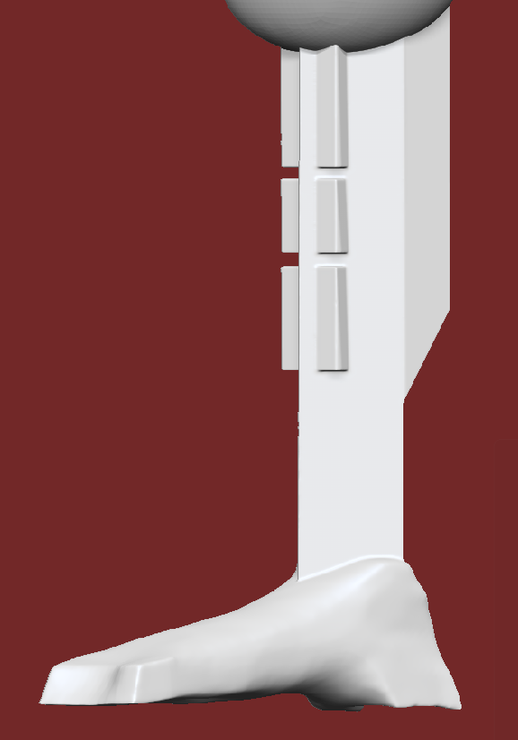
To create the cybernetic leg, I manipulated basic cubes within ZBrush and then dynameshed them together. The foot was then edited with the smoothing brush.
To create the hair and beard, I used fibremesh and changed the settings to make sure the length and number of ‘fibres’. I adjusted the shape of the hair using the move brush so that I could style the hair.
Second Attempt:
I wasn’t happy with my first attempt so I redesigned some aspects of the design. I could then adapt earlier versions into a version following the redesigns closely while avoiding earlier mistakes and issues.
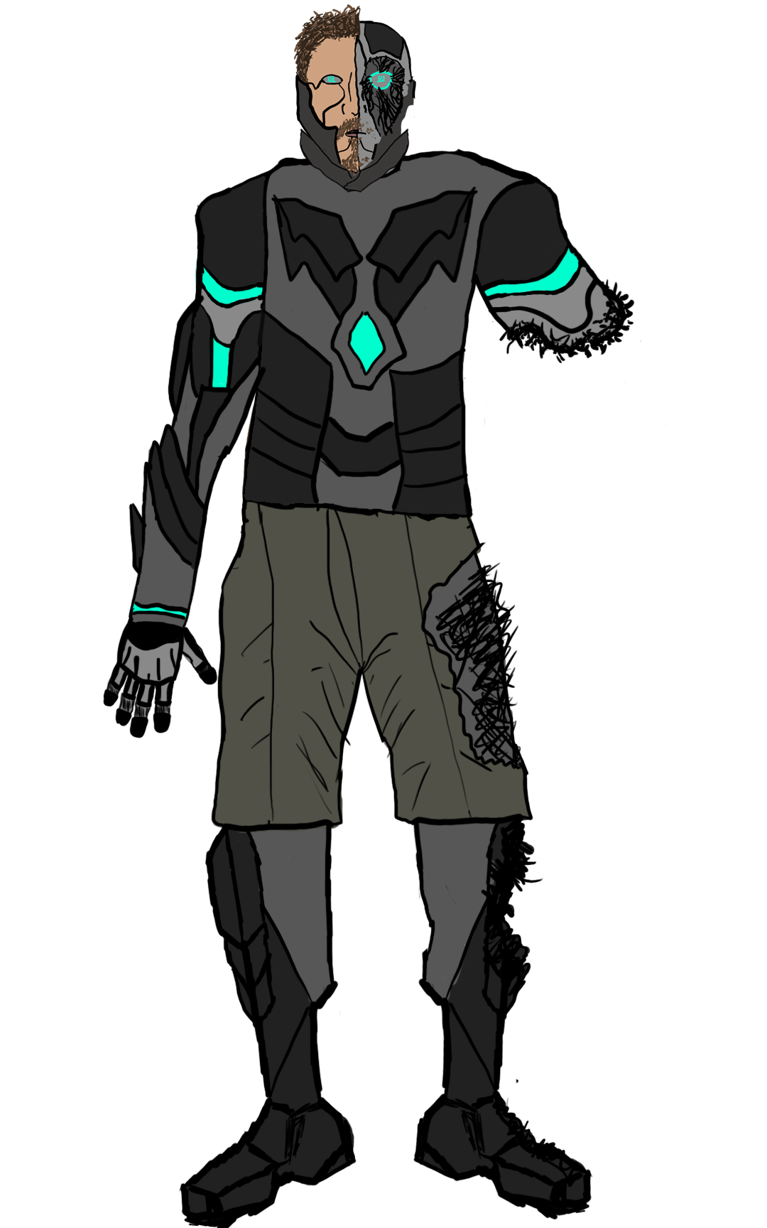
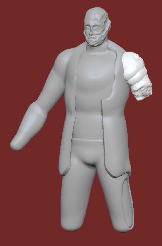
Most of the first model I made while experimenting without a clear plan so for the second design I thought up how I wanted the character beforehand so that it would inform the second model better. The end look probably was going to change but I had a better start with this approach. I redesigned the face and majority of the upper body as I removed the jacket and exposed inner elements of the face.
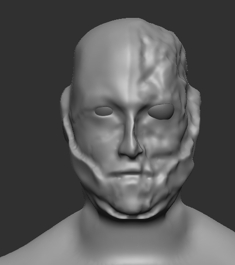
The head of the first model I liked the most but I decided to still change the damage on the left side to match the new design. I reverted to the point before I added the damage and subdivided so I could add more detail as an issue with the first was most of the facial details were lost. I used the dam standard brush to indent into the face, to bring out the lip lines and to create the face border. I turned off symmetry when making the border so it was messy as a straight border wouldn’t fit the character narrative. The damage around the eye was done by indenting the area using the inverse clay brush so that it would take away from geometry. I used the rake brush to create geometry here as this looked like exposed parts within the face and was like the new design sketch. The top-side of the head was masked so that I could use the move brush to indent this area without affecting the rest of the head. I then used the move brush to add more smaller damage.
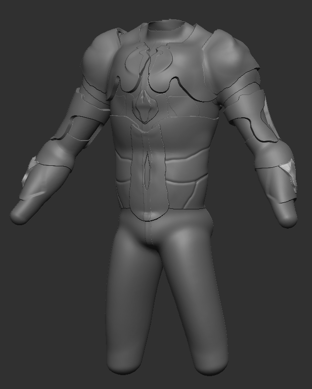
Model Front
The new base model is based off the original as the undamaged side of the body was mirrored so I could get the other arm back as I wanted to make the damaged arm differently. Inconsistencies with the geometry of both sides was fixed but a seam along the middle was created. This would be an issue if it was a human character, but I think the seam added to manufactured feel of my character which is part of the narrative. In any case it would be mostly covered up by the time this variant of the character model is finished.
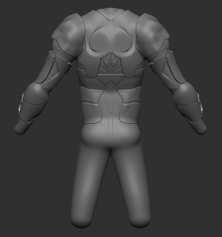
I wanted the armour to be segmented and separate from the base mesh this time so I used the extract tool to get geometry from masked parts of the base mesh and manipulated them using brushes such as move and dam standard. I prefer how this looks compared to the original as it is a more complex design. The pants were created using the extract tool again as the original pants couldn’t be used as they didn’t match the new model.
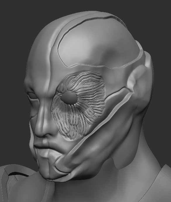
Last time, I ended up losing all the detail on the face so I kept the head separate from the base model this time. There was a way to combine the meshes and keep the detail but I preferred keeping them separate. I manipulated the neck geometry using the different sized move brushes to seemingly make the head connected.
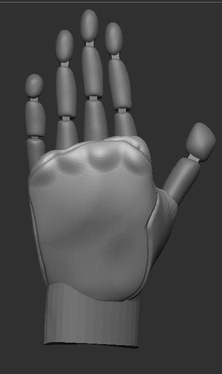

To create the leg model, I decided to use Maya as I thought it would be easier to create the look I wanted. I started with a simple cube mesh and then extruded to create the shape of the leg.
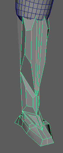
To add more complexity to the model I further used the extrude tool to allow me to scale extruded faces down.
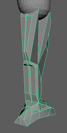

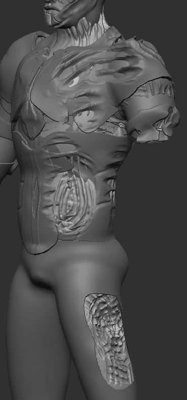
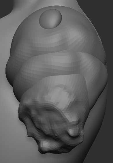
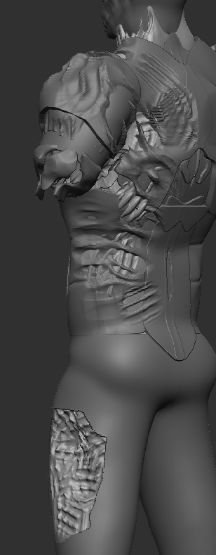
The new version of the damaged arm was done by severely deforming the arm model with the move brush. To create the rest of the damage on the left side of the character, this time I used the rake brush to deform the different elements. I think this method was more effective as this result was like the design this time.
Conceptual Stage and Colour Design
I knew from the start that I wanted to do some kind of cyberpunk inspired character as I was really keen on the idea of a futuristic theme for my character design. To start to conceptualise what my character was going to look like, I first gathered some inspiration images of cyberpunk character designs.
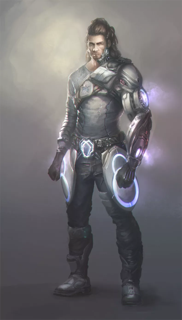
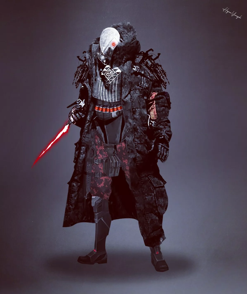
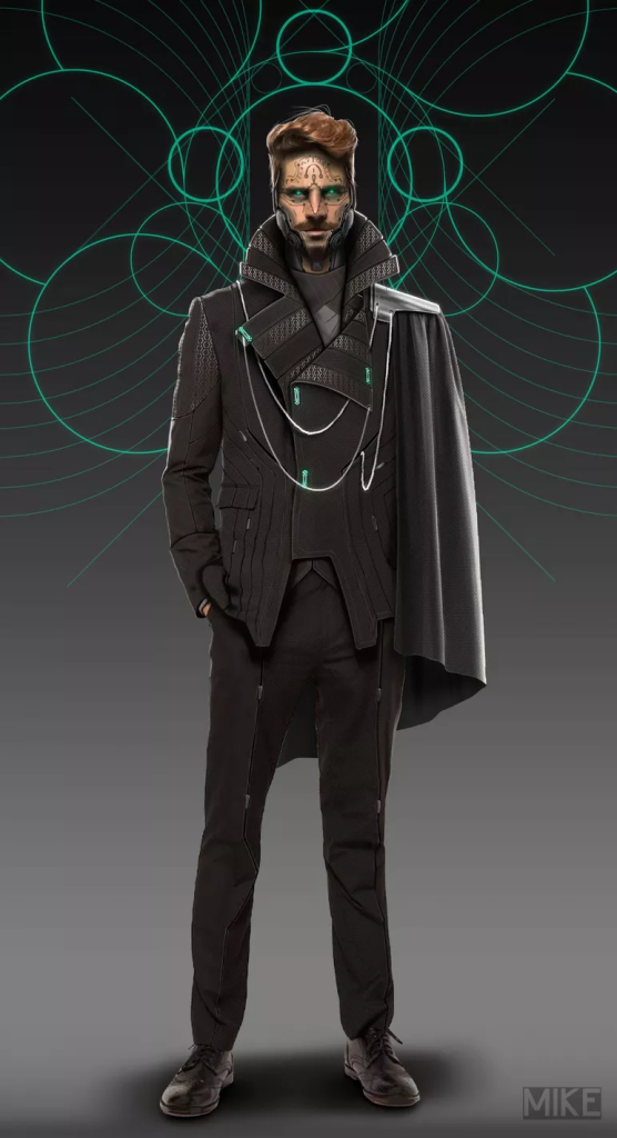
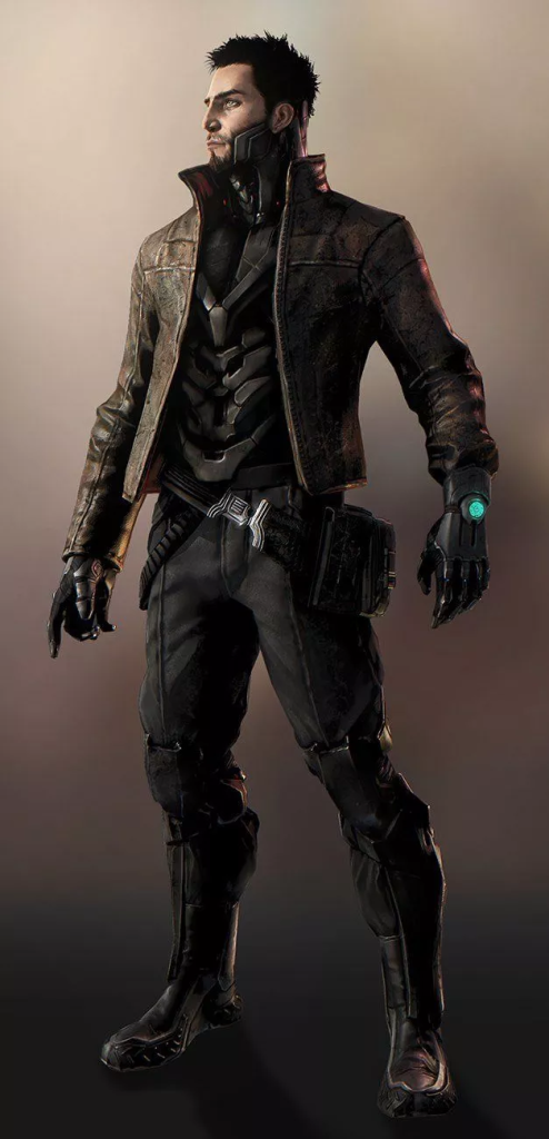
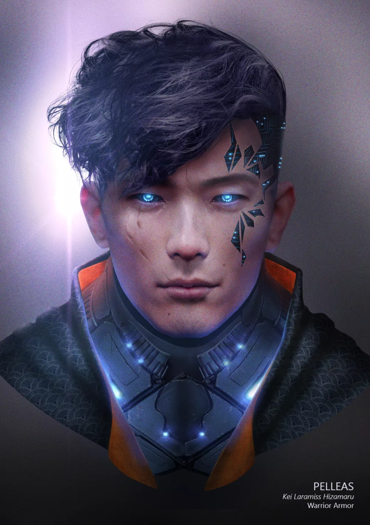
One of the designs I found referred to as Figure 5 (Bonhotal, 2020) had a face design that gave me one of the main aesthetics for my character as it had some machinery visible on only one side of the face. This reminded me of some of the early experimentation period in ZBrush that I had done as I attempted to create a Two-Face model using one of the base models within ZBrush.
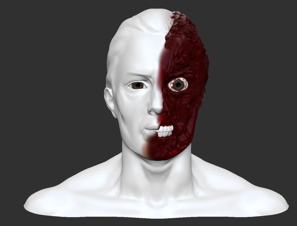
Although not originally part of my character idea, I decided to incorporate the idea of having two different looking sides of my character. as I came to the conclusion that it would make my character design more interesting. This is where the idea of Wyatt getting damaged in their escape came from as it allowed me to explore this ‘Two-Face’ aesthetic within the narrative of my character’s backstory. The two-sided design also helps to further link with my character’s narrative as it shows how Wyatt had their humanity ripped from them with no justifiable reason but also shows how Wyatt is still trying to cling on to the humanity they have left. To further develop this visual theme for my character I also got some reference images for the kind of aesthetic I was seeking.

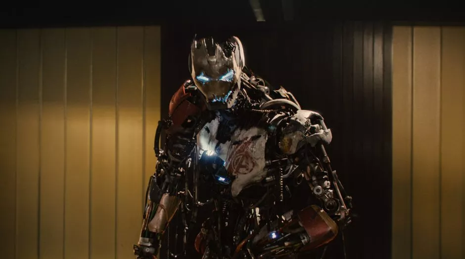
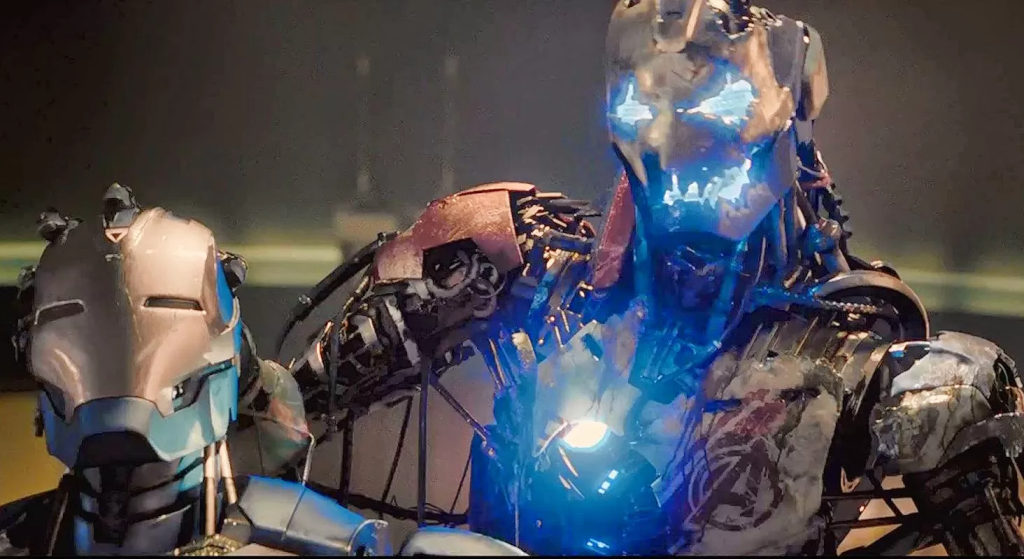
I chose the two images of Ultron from Avengers: Age of Ultron, Figure 7 (Gartler, 2015) and Figure 8 (DWolf, 2015), for reference images as I wanted to mimic the visual look of how the first iteration of Ultron is visibly damaged with vital components visible but in the visual format of Figure 6 (JPGraphic, 2015). This is so there is a clear distinction between the two sides of my character design and also to make it more intriguing.
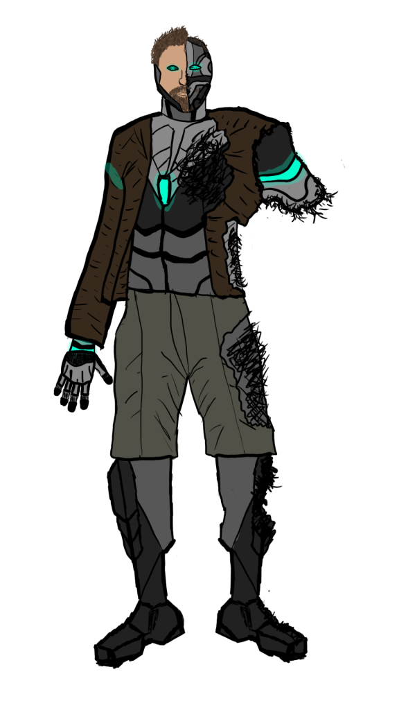
My first iteration of my character design took heavy inspiration from Figure 4 (Giraud, 2015) as that was my favourite reference image out of the cyberpunk references. I wanted to make a similar design to it but with the two-sided visual theme and with some inspiration from the other cyberpunk references namely the leg design of Figure 2 (Germán, 2019) and the left arm design of Figure 1 (Cornet, 2016). The body style that I aimed to go for was as realistic as possible. Obviously I would have to take some liberties with the cybernetic parts but I wanted the proportion of the character to match or be similar to realistic proportions. This meant that the silhouette of my character would be harder to recognise but the fact that have of the body is damaged causing an arm to also be missing helps to mitigate this.
I chose a dark and drab colour scheme for the concept drawing of the character as I wanted the colours of the character to match with the dark narrative I crafted for their backstory and the dystopian nature of the cyberpunk genre in general. These dark colours also contrast with the bright blue cybernetic colour that I used for certain aspects of the design to further show how these superhuman augmentations aren’t natural and were forced upon Wyatt. This also plays into how they have been forced into an exile of sorts as they won’t be able to comfortably be around people, at least at first, as the cybernetic differences will be a lot for many individuals to take in and could be the cause of contention or distrust.