Conceptual Stage and Colour Design
I knew from the start that I wanted to do some kind of cyberpunk inspired character as I was really keen on the idea of a futuristic theme for my character design. To start to conceptualise what my character was going to look like, I first gathered some inspiration images of cyberpunk character designs.
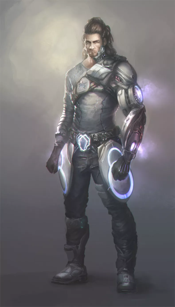
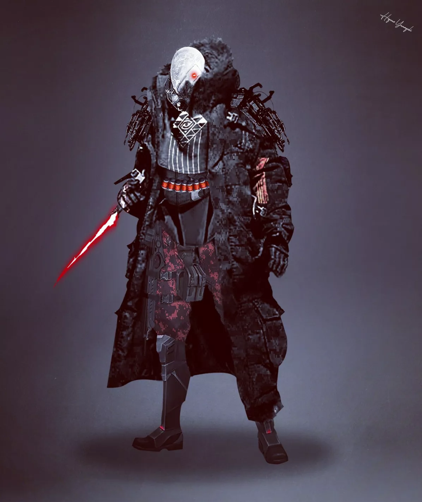
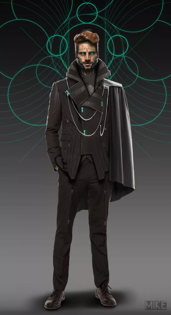
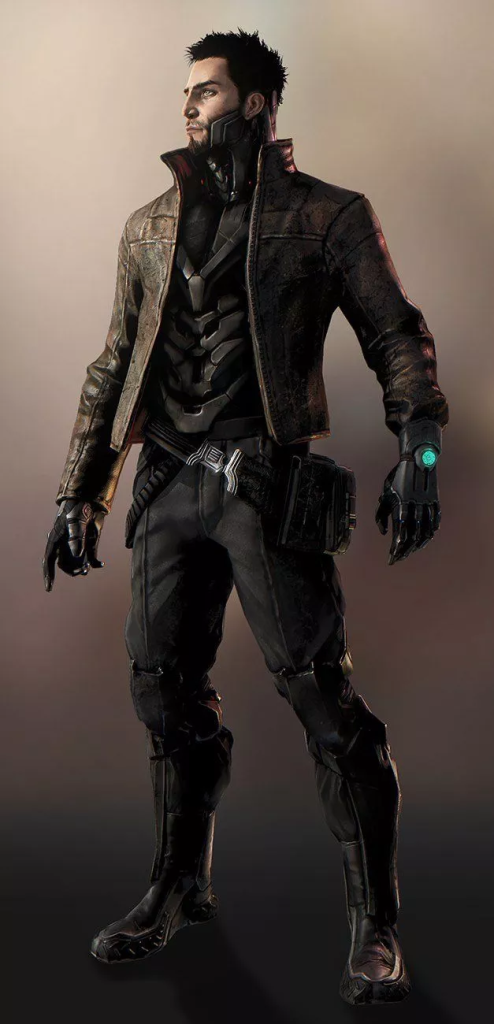
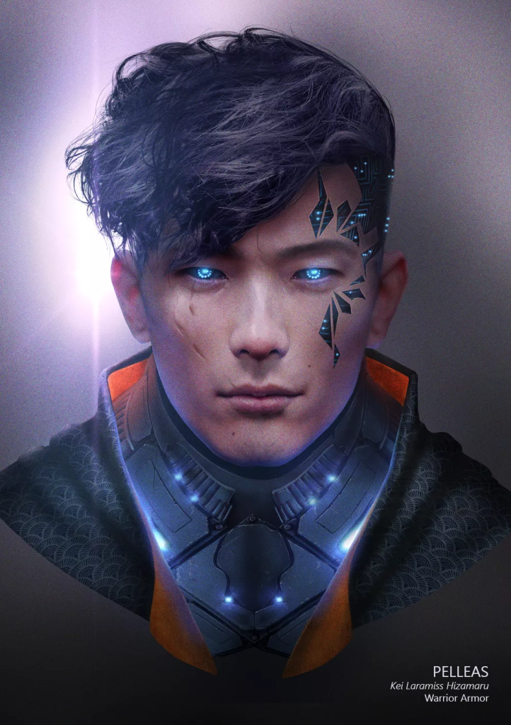
One of the designs I found referred to as Figure 5 (Bonhotal, 2020) had a face design that gave me one of the main aesthetics for my character as it had some machinery visible on only one side of the face. This reminded me of some of the early experimentation period in ZBrush that I had done as I attempted to create a Two-Face model using one of the base models within ZBrush.
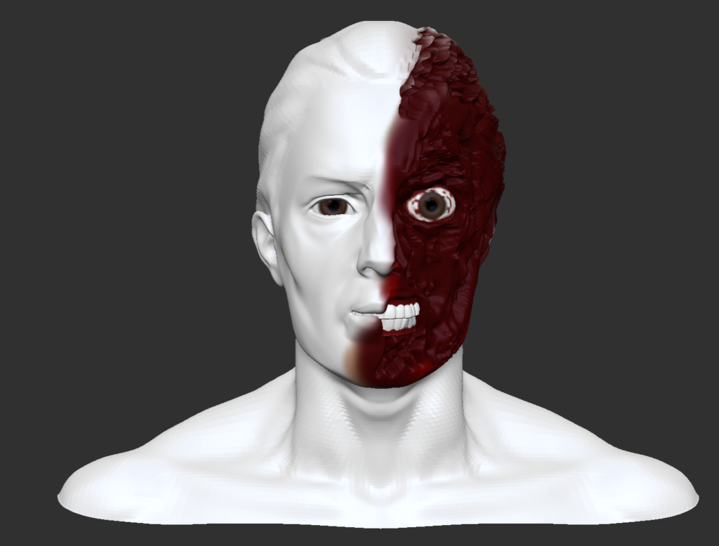
Although not originally part of my character idea, I decided to incorporate the idea of having two different looking sides of my character. as I came to the conclusion that it would make my character design more interesting. This is where the idea of Wyatt getting damaged in their escape came from as it allowed me to explore this ‘Two-Face’ aesthetic within the narrative of my character’s backstory. The two-sided design also helps to further link with my character’s narrative as it shows how Wyatt had their humanity ripped from them with no justifiable reason but also shows how Wyatt is still trying to cling on to the humanity they have left. To further develop this visual theme for my character I also got some reference images for the kind of aesthetic I was seeking.
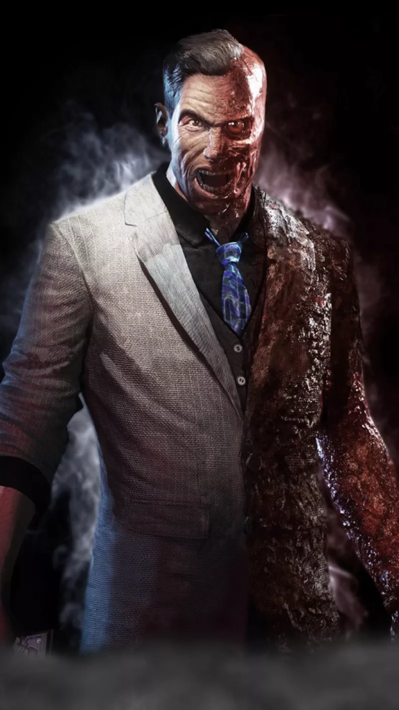
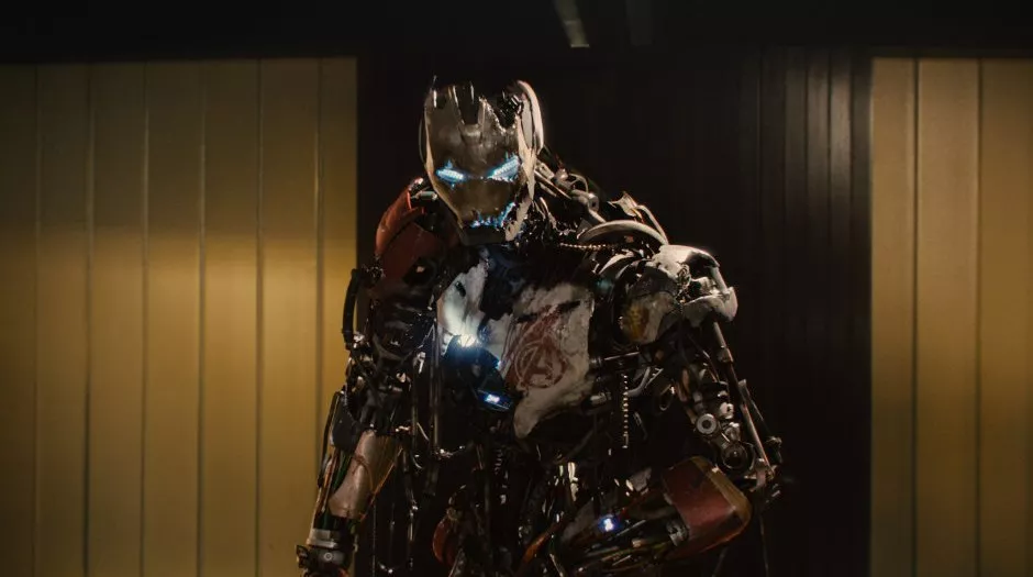
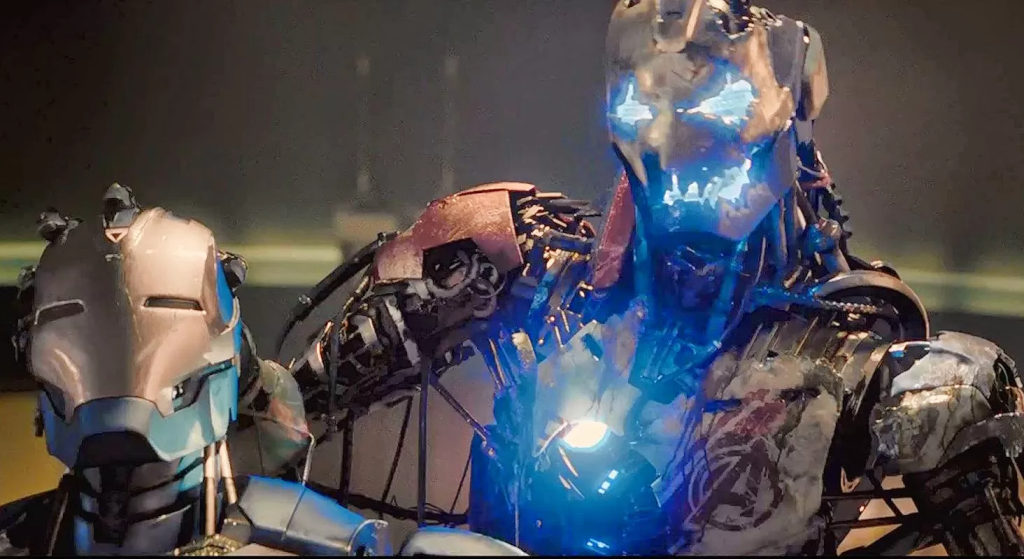
I chose the two images of Ultron from Avengers: Age of Ultron, Figure 7 (Gartler, 2015) and Figure 8 (DWolf, 2015), for reference images as I wanted to mimic the visual look of how the first iteration of Ultron is visibly damaged with vital components visible but in the visual format of Figure 6 (JPGraphic, 2015). This is so there is a clear distinction between the two sides of my character design and also to make it more intriguing.
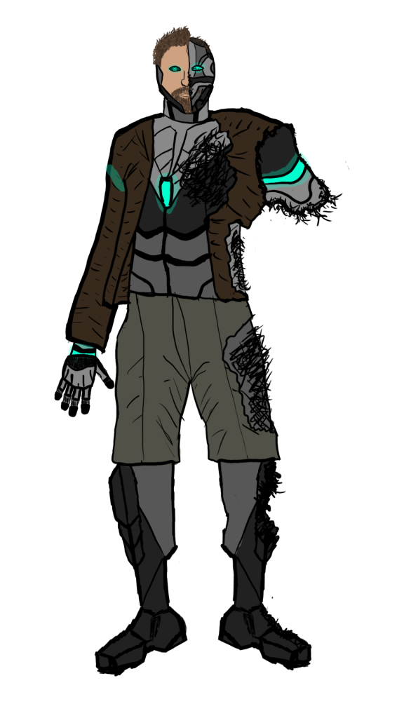
My first iteration of my character design took heavy inspiration from Figure 4 (Giraud, 2015) as that was my favourite reference image out of the cyberpunk references. I wanted to make a similar design to it but with the two-sided visual theme and with some inspiration from the other cyberpunk references namely the leg design of Figure 2 (Germán, 2019) and the left arm design of Figure 1 (Cornet, 2016). The body style that I aimed to go for was as realistic as possible. Obviously I would have to take some liberties with the cybernetic parts but I wanted the proportion of the character to match or be similar to realistic proportions. This meant that the silhouette of my character would be harder to recognise but the fact that have of the body is damaged causing an arm to also be missing helps to mitigate this.
I chose a dark and drab colour scheme for the concept drawing of the character as I wanted the colours of the character to match with the dark narrative I crafted for their backstory and the dystopian nature of the cyberpunk genre in general. These dark colours also contrast with the bright blue cybernetic colour that I used for certain aspects of the design to further show how these superhuman augmentations aren’t natural and were forced upon Wyatt. This also plays into how they have been forced into an exile of sorts as they won’t be able to comfortably be around people, at least at first, as the cybernetic differences will be a lot for many individuals to take in and could be the cause of contention or distrust.