Photo Manipulation in Photoshop
First Version of Image

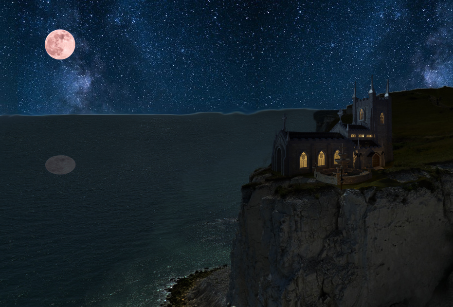
The above image is my first attempt at making the church on the cliff using image manipulation in Photoshop but it wasn’t my first time using Photoshop even though my prior experience wasn’t that in depth and was quite a while ago. I started with an image of a cliff side with a port in the daytime. I used the clone stamp tool to cover up the port with the ocean and I replaced the sky with an image of the night sky. Also, I ‘smudged’ the line (using the smudge tool) between the two images to make the images look better together and I added a moon into the sky. The main part of the image is the church placed on the cliff edge. I took the church from another image and cut it out using the selection tools available in Photoshop. To add some semblance of realism to the image, I added a reflection of the sky in the ocean by copying part of the sky and the moon and flipping it vertically as well as turning the opacity down to around 10%. I also turned the brightness down on the parts that I used from the photo in the day using adjustments. The image turned out pretty well in my opinion although I could have improved multiple parts of the image such as the reflection and the ocean line. Considering I hadn’t used Photoshop for a while I feel like I managed to turn out the image quite quickly but if I had taken more time I could have fixed the issues I mentioned.

Second Version of Image

After finishing the first version of the image, I failed to realise that the ocean line varied in height even though there was no reason for it to do this in the image. This was because when I replaced the port that was at that part of the image, I didn’t bring the ocean line down when it should have been. I once again used the clone stamp tool to rectify this issue. To try and make the moon look more natural in the sky I used the blur tool but it didn’t make that much of a difference so I aren’t happy with it. With the change to the ocean line, I think the image looked better as it made it look more natural.

Third Version of Image

To try and make the reflection more realistic, I got an image of the moon being reflected in the ocean (pictured below) and attempted to isolate the reflection the best I could. I then placed it underneath the moon. I feel like it is an improvement over the previous reflection but I think it looks out of place so if I were to do more improvements I would try to make that and the moon look like they fit more naturally in the image.

I enjoyed using Photoshop to manipulate images but I feel like I would rather make 2D art using other methods as I feel like I would be able to produce better quality images using other methods.

Texturing and Baking in Substance Painter

This week’s task was about texturing and baking an asset using Substance Painter. The asset that I chose to use was the crate that I made for the high poly and low poly task.

Before I could start with the task for this week, I had to make some minor changes to my previous work to make them ready for this task. I deleted some parts of the high poly model that could be duplicated later to save some time when texturing and baking and moved the handle on the low poly model to the other side so that it matched up with the handle labelled A on the high poly model.

When I baked my high poly model onto my low poly model, there were some issues with parts of the baked textures so I decided to use the provided models instead of my own. It was easier then spending more time changing parts of my own models and would allow me to focus on this week’s task.

I baked the provided models and started to experiment with texturing. To start I added a smart wood material to the crate as a base to work with. To make sure it only made the parts of the model wood that were supposed to be wood I used the polygon fill tool and a mask. I then added a new fill layer separate from the wood group for the metal. I used the same mask technique so that only the metal parts would be metal and put the metal slider to 1 in the properties of the fill layer. I also chose a suitable colour for the metal. To make the wood have a more realistic feel I then started to use grunge by adding a new fill layer with a black mask and adding another fill layer to that mask. In this new fill layer I added one of the grunge textures and experimented with the different settings. I also added a second grunge layer to add more variation to the look of the wood.

I now wanted to add some text to the crate. To do this I created a new fill layer and created a group called Engraving. I then once again added a black mask to the fill layer but this time I added a paint layer to that mask though which allowed me to use the brush tool to add text. I added the word Hull to the front of my crate and edited the height of it so that it would look like it was engraved. I did a similar thing to add the warning on the side except I changed the colour and made the height 0 so that it would look like it was stamped on.

To finish the texturing of the asset I added a smart material to the metal parts of the model and a smart mask to all of the model. The smart material made the metal look like realistic and the smart mask added some dirt to the bottom of the crate as a whole so that it looks like the crate has been used.

Shaders and Textures

To start the task for this week, I first had to create a small ‘art studio’ consisting of a vase, two material spheres and a table. To make these I used my knowledge from the prior weeks such as the extrude tool and subdivisions. The vase started out as a cube that I used edge loops and subdivision on to create the model that I wanted. I then used extrusion and the move tool to make the vase look how it does now.

After the models were done, I had to set the scene up for the render. To do this I had to add a camera and lights as shown in the image below. To test what my render would look like at this point I added an AI standard surface material to the models so that I could do a test IPR render. This allowed me to know whether I had to change my light settings because it doesn’t display correctly until rendered.

Test Render

I then changed the material properties of the different model in the scene so that they each were different. I made the vase look like glass and the spheres look like different metals. I also added a ramp to the background to create a gradient effect in the render.

After changing some of the render settings, I then was ready to do a final render. I let the image render fully at a higher resolution then the test renders I did and then saved the image of the render which is shown below.

Final Render
Proportional Drawings
Body Proportion Image

The above image is my first attempt at drawing the proportions of the human body. For a first attempt, I think I did pretty well but there are things that I would change about the image. Firstly, I would draw the feet again as I kinda gave up with the feet here and turned them into some kind of socks. Also, the size of the arms on both sides don’t match up all that well so I would like to fix that too. I would like to also make the character a little less muscular and fix the leg proportion since they are too short. To make this picture I used the 8 head measurement system although I messed up by forgetting one of the marks which is what made the proportions of the legs wrong.

Body Proportion Image 2

For my second attempt at body proportion, I wanted to draw a person in clothes as my art piece for the assignment will be a person wearing clothes. I managed to improve on the actual proportion of the body as my first image was wrong. I feel like the body may be a little too wide for this image but I still feel like it is an improvement on my first one. To improve on this image I could use reference images to improve upon the detail on the clothes and face.

Face Proportion Image

This image was my first attempt at doing the proportions of the human face. I used the circle method when drawing the face to mark out the approximate position of the eyes, nose and mouth. This made it easier to mark out where the rest of the parts of the face should go. After doing the basic parts of the face, I used the reference image below to add some detail to the face. I think that this turned out pretty well though I could still make improvements.

Reference Image
Face Proportion Image 2

Instead of doing something different like I did for my body proportion second attempt, I decided to try and use the same reference image for my second face proportion image. I think I managed to make the face resemble the reference more then the first attempt and made the face a bit more symmetrical though not completely as that isn’t realistic.

Doing these proportion drawings has helped me to have a better understanding of how to draw the human body somewhat accurately and this will help me with my assignment since I intend to do a character design.

UV Editing in Maya

First Task

For the first task this week, I had to add a simple texture to a cube in Maya and then edit the UV of the cube so that the texture would match up correctly. To do this I first created an automatic UV so that I could start to edit it. To match the UV to the texture I selected each edge of the UV shells and used the move and sew tool so that the UV shells would be connected. After this I selected the UV points of the shells and moved them so that they lined up with the texture edges. After doing this the box texture matched up correctly.

The UV of the Box
The Textured Box

Second Task

For the second task, I had to experiment with making a UV for a more complex model (shown above). To do this I made a UV based on the camera position. After making this UV, I had to add 3D cuts to the UV using the 3D Cut and Sew UV tool so the different shown parts of the model would have a different UV shell as shown below. I then had to unfold the UV shells so that I could add a texture to the model later. Some parts of the UV unfolded on an angle or with a curve so I had to edit them a little bit. For most of it, all I had to do was use the straighten UVs function but for the curved part that wouldn’t work correctly. To do that part, I had to first scale the edges of the UV shell so that they were flat. The left and right edges had to be moved a little so that the UV was still inside the shell properly. To make sure that the UVs could now be straightened I used the pin function of the left and right edges and then unfolded the shell again. This made it so the UV shell could now be straightened correctly after unpinning the parts of the shell. When I unfolded the UV for the bottom cylinder, there was an issue with the UVs in the shell as the circle from the bottom and top of the cylinder had UVs on the shell for the side faces as well. To solve this I deleted the extra UVs in UV select mode and then used the solution for the curved UV shell to make sure this UV shell also straightened out correctly. I then used the layout function with 5 pixel shell padding to make sure the UV shells were properly spaced out.

The UV of the Complex Model

Final Task

The UV created from my Low Poly Model

For the final task, I had to create a UV of one of my previous projects: the low poly model from the HP and LP model exercise. This wasn’t very complex to do as I created an automatic UV from the different parts of model. There was a minor issue with this as the faces on the inside of the handle hole didn’t count as one UV shell. To rectify this, I used the stitch together function on the edges that were between the unconnected faces. To make sure that all the UV was consistent on all the parts I had to change the Texel Density of the UV to 5.12. I also had to use the Layout function to make sure the different UV shells didn’t overlap. The only problem after doing this was that the UV shells were too close together so I added a shell padding of 10 pixels to the shells by navigating to the modify tab in the UV editor and changing it in the layout menu. This created the UV shown above.

Group Theme 2 Discussion

In theme group 2, we decided that our theme was going to be medieval based. This allows a lot of room for choice in terms of what we can make. We will discuss further to decide on a specific location for our theme such as a battlefield or a camp.

The assets that I could do:

  1. Arrows/Quiver
  2. Anvil
  3. Tent
  4. Weapon Rack
  5. Armour
  6. Bench
  7. Campfire
  8. Axe in a Tree Stump
  9. Bed
  10. Tankard
Creating a HP and a LP Crate

High Poly Crate

To start my model of a crate I made a cylinder and rotated it onto its side. I then selected 3/4 of the cylinder using face select and deleted it. This left part of the cylinder that I could use to start my crate but I still had some of the cylinder left to delete so I once again used face select to delete all the parts of the cylinder except for the remaining faces of the top.

After deleting all the parts of the cylinder I didn’t need, I extruded the right edge of the faces I had left so that half of the handle shape was created. I then extruded the bottom edges of the model but then returned the pivot to center so that I could made the extruded part have a straight edge. The left edge then needed to be extruded and I deleted the faces that originated from the cylinder as well as the first extruded part from the right edge of those faces.

I then mirrored the model I had so that I could create the basis for the handle plank of my crate. To make it look more like a crate I used the extrude tool to add thickness and the scale tool to make it longer. So the model would stay true to its shape when smooth I added support loops using the multi-cut tool as shown in the image above.

To create the basis for the other planks, I added a cube and used the scale tool to make it a closer size to the handle plank. I then used vertex select and the point snap feature so that the cube was close to the same size as the handle area. I also made sure to use the multi-cut tool for support loops. I then duplicated this plank and moved it above the handle so the basis for the front handle of the crate was done for now. Before I duplicated the handle for the back handle, I combined the parts into one mesh so that each handle/side would be one separate part of the model rather then each plank.

To start the sides of the crate I duplicated the front again and scaled it so that it matched the space between the front and back handle. I also used the move tool so that I could fit it in a little more precisely. I then deleted the handle plank and selected the plank above where the handle was. Using shift right click I was able to duplicate the plank on its own and I moved it into the space where the handle was. Then I scaled it so that it would match the size of the handle plank that was previously there. I then combined the new plank with the other two and duplicated the combined mesh to create the other side by moving it to the other side of the model.

To create the base of the crate, I created a cube again and then scaled it so that it would be easier to match it to the size of the crate. I then used the point snap feature again by selecting vertices on each of the edges of the base so that it was the correct size. I also used point snap on the planks so that they were closer together for the baking process later on.

To make it look like my planks were not magically connected I decided to attempt to make some screws. To start them I created a cube and deleted half of the faces since they wouldn’t be seen. I then used a combination of the bevel tool, multi-cut tool and extrude tool to make an indent in the cube to mimic the top of a screw and then move it further in. I duplicated this screw multiple times so that there was two screws for each side of a plank.

To finish off the model I smoothed all of the parts of the high poly crate model so that it would be exported smoothed and I grouped and named all the parts so that later processes could work properly. The second image above also shows the poly count.

Finished High Poly Crate

Low Poly Crate

To start the low poly version of my model, I started again with a cylinder and lined it up with the high poly handle hole. This is so I could easily recreate my model in at least a similar fashion. However, I couldn’t replicate the exact shape of the HP handle hole as I edited the shape of the hole so I couldn’t make the hole in the exact same way.

I scaled the remaining faces of the cylinder to match the shape of half of the HP handle hole and then extruded from the bottom edges of these faces. To make the edges straight I scaled them up which made it possible for me to match up the edges with the bottom of the original handle. I then used a combination of the extrude tool and move tool to create the LP version of the front handle as shown in the image above. To decrease the poly count of the model I used the weld tool to weld some of the vertices together.

I duplicated the handle part again to create the side of the model and used the merge to center function on the vertices of the handle to get rid of the handle. I then got rid of any extra unnecessary edges. To get the base I duplicated the first base I made for the HP model and removed the support loops that I added.

The images above show the naming conventions for the LP model parts and the overall poly count compared to the poly count of the LP model.

Finished Low Poly Crate
Model of a Table with a Bowl and Fruit (Using NURBS)

To start the model of the table I used the EP curve tool to draw a curve using the side view.

I then used the revolve tool to create a model from the curve that would act as the stand of my table. To create the table top I added a polygon disc and used the scale and move tools to make it bigger and place it where it looked like it was connected to the stand.

To create the table cloth I duplicated the disc that I used for the table top and used to scale tool to make it bigger then the top. I then adjusted the subdivisions of the duplicated disc and added nCloth to it. I also added a passive collider to the table top so the cloth would actually wrap around it rather then falling through. To activate the cloth simulation I pressed the play button in the timeline.

To create the bowl I added a polygon sphere and deleted a little over half of the faces from the top so that it would look like a bowl.

I then used the extrude tool to change the thickness to 0.1 and the scale tool so that it was bigger and could fit some fruit in.

Before adding the fruit, I assigned new materials to the different models by holding right click. I used the lambert material for the models and changed the colour to match what I intended for each model.

To create the fruit I added the sphere primitive and used the vertex select to add a dip in the top of the sphere. To make an orange I used the scale tool to squish the sphere down so it would be more orange shaped. To make an apple I used the scale tool to edit the shape of a duplicated sphere so that it had a shape similar to an apple. I then duplicated them so that there was an adequate amount of both fruits. To make them somewhat like the actual fruits I added materials to them so that they had colour.

Final Model
3D Model of a Mug

This 3D model of a mug is my first project with Maya so I decided to use the tutorials provided by the university as a basis to create the model. This is so I could get a feel for the software and start to be confident in using it.

To start the model, I created a cylinder primitive and set the subdivision height to 8 and the subdivision caps to 0. The reason I did this is so it was easier to manipulate the cylinder into a mug shape and to delete the top face of the cylinder.

The next step was adding edge loops to the top and bottom of the cylinder so I could edit the shape of the mug to make it look more like a real mug. I also deleted the top face of the cylinder so that the model would start to become a mug.

I then used the extrude tool to change the thickness of the model to 0.1. To add a curve to the model I switched to the side view and selected the vertices on all but the bottom part of the model and used the scale tool to bring them out. I then repeated this without the second to bottom layer to improve the curve. After this, I used the scale tool again to lengthen the mug.

To start the handle part of the mug, I added a torus primitive and changed the subdivision height to 8. I had to use the rotate tool to rotate it so that it was at the right angle so that it could be used to make a handle. I then used the face selection to highlight half of the torus and delete it and used the move tool to align it with the mug.

To make the handle look more like an actual mug handle, I edited the radius and section radius properties of the torus so that it was thinner and had more space for a hand. The next thing I needed to do was attach the handle to the mug and to do this I first had to delete the faces that the handle was touching on the mug. I also had to combine the cylinder and torus so that they became the same object so that there were no errors when attaching the handle to the mug. I selected a vertex on the mug and the top part of the handle and merged them using the merge to center function and then repeated this for the rest of the vertices on the top and then the bottom.

The model of the mug was now complete but I still had to add a material to the mug. To do this I had to select the mug in object mode and then hold right click so I could add a new material to the model. The material I added was called Blinn. I used this material so there was a bit of shine on the model and so I could change the colour of the mug.

Final Mug
Final Mug Smooth